On this page
- The short version
- What makes a good poster idea
- Event poster ideas
- Shop and small business poster ideas
- School and club poster ideas
- Prom and dance poster ideas
- Wall art poster ideas
- What every poster needs
- How we made the 16 example posters
- Turn any idea here into a poster with Krumzi
- When you should use something else
- Your next poster
- Frequently Asked Questions
You need a poster up this week. The bake sale is Friday, the shop window is empty, or the club fair is Tuesday and nobody knows your club exists. You open a blank page, search for poster ideas, and get a wall of pretty pictures with none of your details on them.
Here are 30 poster ideas sorted by where the poster hangs: events, shops and small businesses, school and clubs, prom and dances, and your own wall. Each idea comes with one line on why it works and a one-sentence prompt you can copy. Sixteen of them have the real poster we made from that exact sentence, so you can see what comes back before you spend a minute on it.
Pick the group that matches your wall, steal the idea that fits, and swap in your own name, date and place.
The short version
- Pick by the wall, not by taste. A poster on a street pole needs one fact readable at walking pace. A poster on your bedroom wall can be quiet, because you'll see it every day.
- Make one thing huge. The date, the price, the question or the name. Everything else stays small.
- Put what, when and where together. Readers look for those three facts in one place. Scatter them and they read none of them.
- Give one action. Buy a ticket, scan the code, come in Saturday. One.
- Write the real details into the prompt. A one-sentence brief with the name, date, place and price gets you a poster you can print. A vague one gets you a mood board.
What makes a good poster idea
A good poster idea is one concept a stranger understands in two seconds from across a room: a giant date, a single object, one bold question or one number. Choose it by where the poster hangs. Event posters lead with the fact people care about most, shop posters carry one offer and one action, and wall posters can be quieter.
That's the whole test. If you can't describe the idea in five words ("the date fills the page"), it's two ideas fighting, and the poster will lose both.
Event poster ideas
Markets, gigs, fundraisers, talks and festivals. These posters compete with ten others on the same corkboard, so the idea has to win from a distance. If you want a poster for a specific event type, our AI event poster maker is built for exactly this.
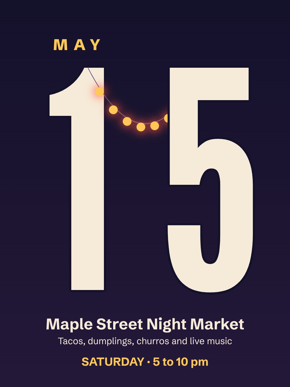
1. The giant date
Make the day of the month the biggest thing on the page. People decide whether they can come before they decide whether they want to, so the date does the selling.
Prompt: A poster for the Maple Street Night Market on Saturday, May 15, 5 to 10 pm, with the date set huge as the main graphic and "Tacos, dumplings, churros and live music" in small type underneath.
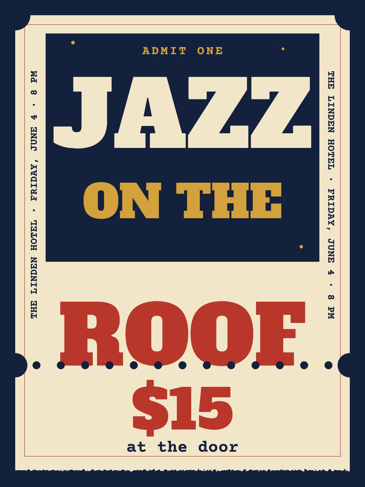
2. The ticket stub
Lay the whole poster out like an oversized ticket, with a tear line and the price on the stub. It tells people "this is something you pay to get into" before they read a word.
Prompt: A poster for Jazz on the Roof at The Linden Hotel, Friday, June 4, 8 pm, designed like an oversized vintage ticket stub with a tear-off edge and $15 at the door.
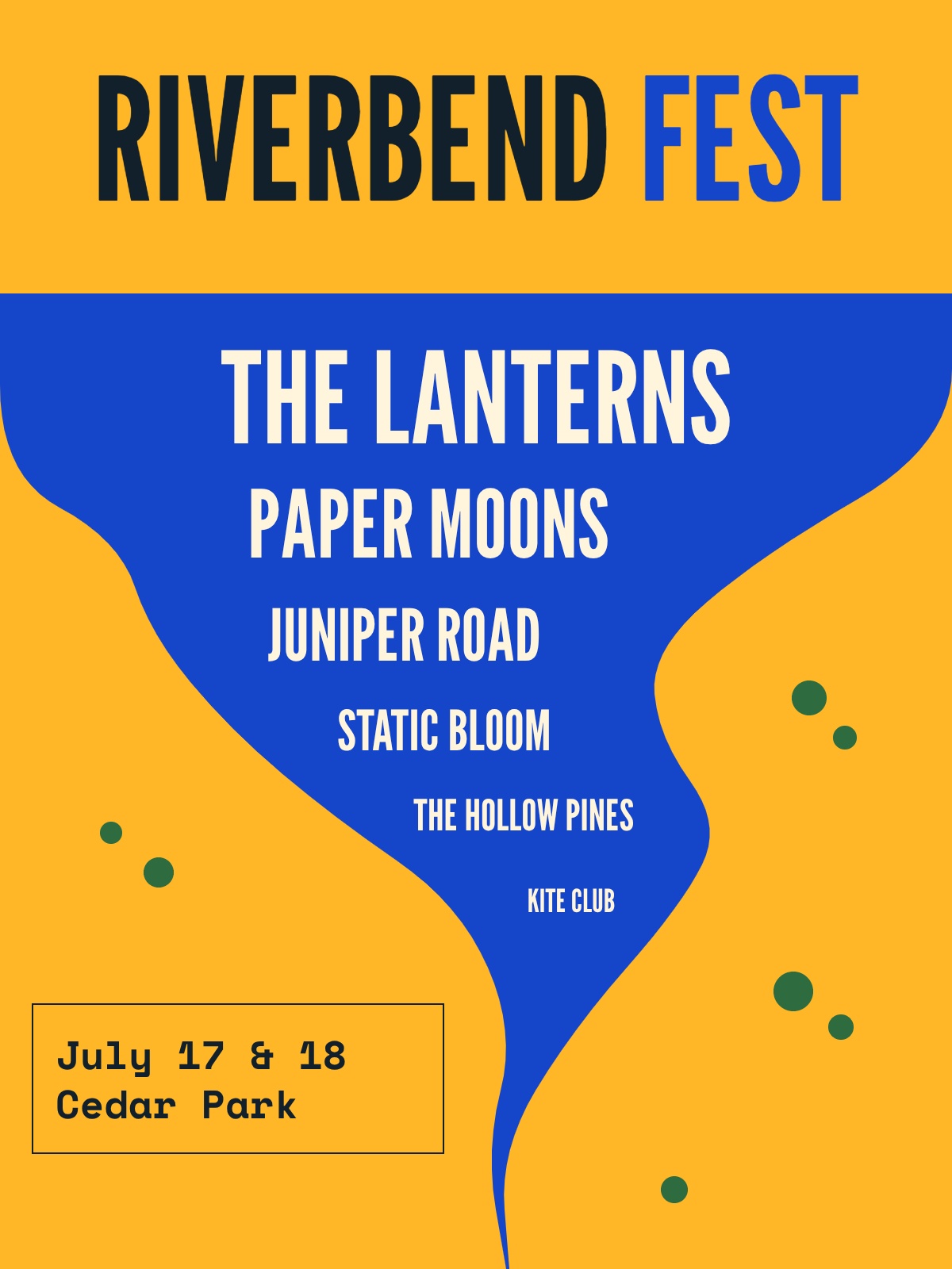
3. The lineup ladder
Stack the acts in shrinking sizes, headliner on top. Festival crowds scan for one name they know, and the ladder lets them find it in a second.
Prompt: A summer music festival poster for Riverbend Fest, July 17 and 18 at Cedar Park, with The Lanterns, Paper Moons, Juniper Road, Static Bloom, The Hollow Pines and Kite Club stacked in shrinking sizes like a classic lineup poster.
4. One object and one number
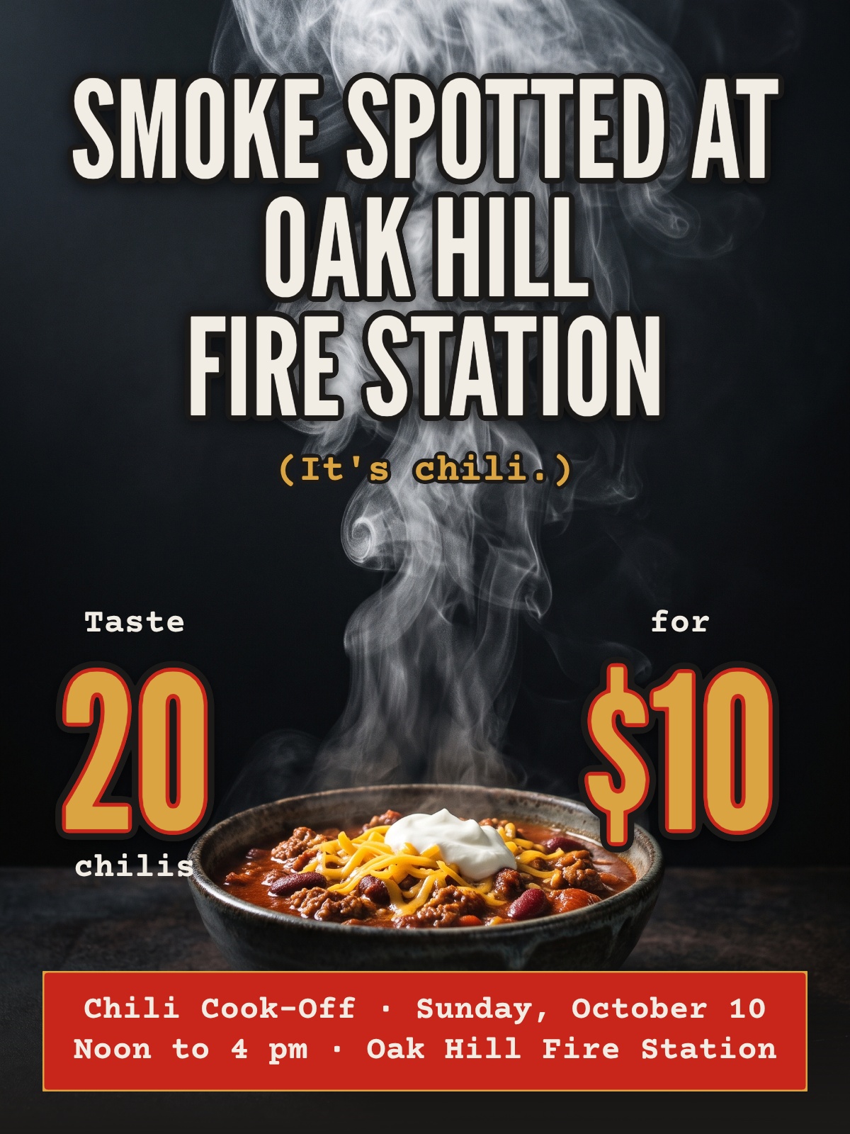
Show a single object that is the event, then pair it with the number that makes it a deal. A steaming bowl and "20 chilis for $10" sells a cook-off faster than a paragraph about it.
Prompt: A chili cook-off poster for the Oak Hill Fire Station, Sunday, October 10, noon to 4 pm, with one steaming bowl of chili as the only image and "Taste 20 chilis for $10" as the hook.
5. Cause first
For a fundraiser, the largest line says what the money does. Nobody goes to a gala for the word gala. They go because $8,000 fixes the animal shelter's roof.
Prompt: A fundraiser poster for the Northside Animal Shelter with "Help us raise $8,000 for a new roof" as the headline, a dinner on Friday, March 12 at 6 pm at St. Mark's Hall, and tickets at $40.
6. The question poster
Ask the one question your audience is already asking themselves, set large, with the talk or workshop details small underneath. A question makes people answer it in their heads, and that's a second of attention you didn't have.
Prompt: A free library workshop poster asking "Is your phone full again?" in big type, with "Learn to clear space and back up your photos, Tuesday, April 6 at 2 pm, Elm Grove Library" underneath.
7. The countdown series
Print "3 weeks" huge, then swap in a new poster each week until race day. People notice the change, and a fresh number makes an old wall look new.
Prompt: A charity 5K poster with "3 WEEKS" filling the top half, "Run the River 5K, Saturday, June 12, 8 am, Riverside Park, $25 entry, all proceeds to the food bank" below, in bright race-day colors.
Shop and small business poster ideas
Window and counter posters are read by people who are walking past. One message and one action. The goal is simple: they stop, then they walk in.
8. The grand opening
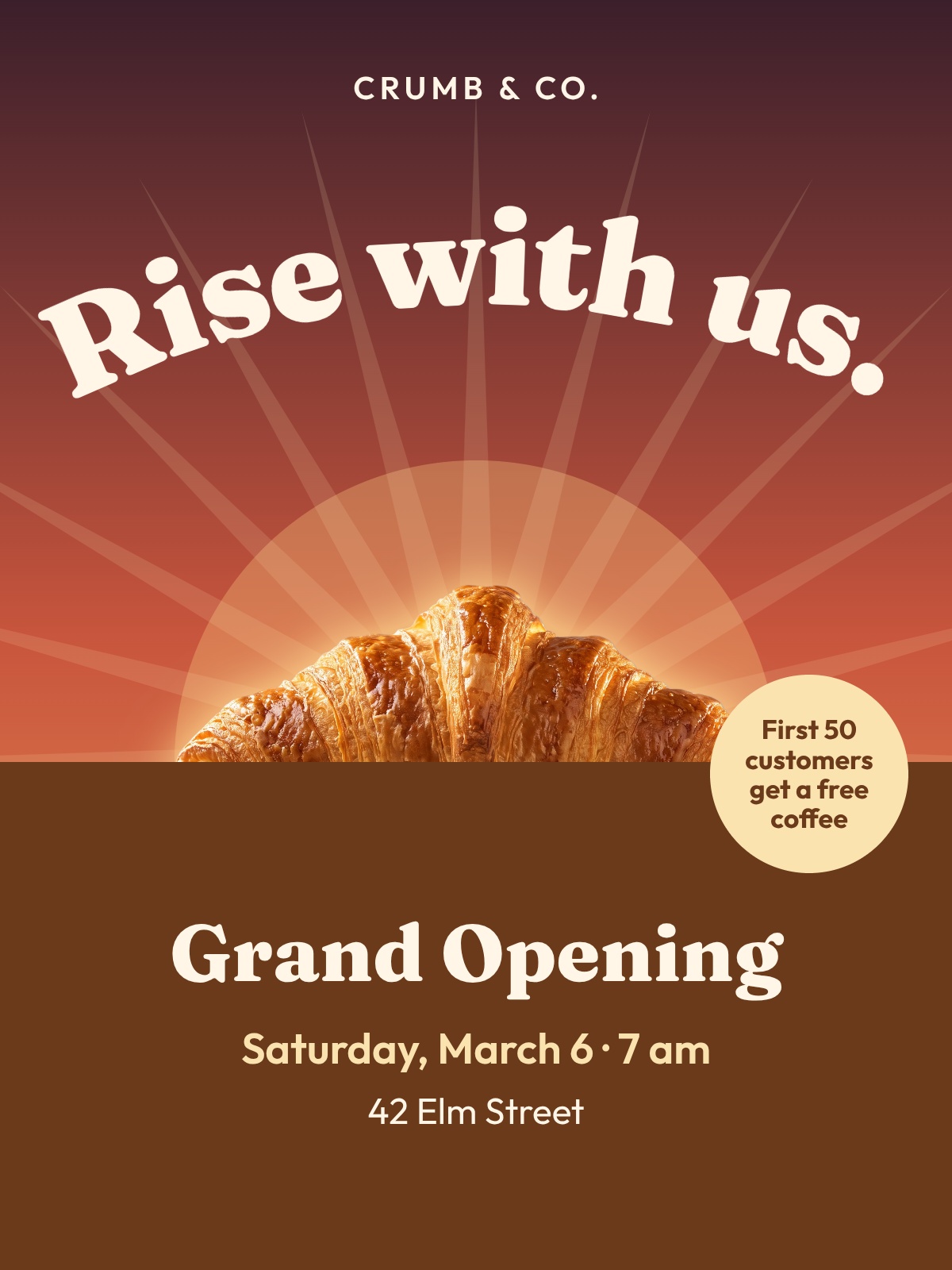
Lead with the offer, then the date, then the address. "Free coffee for the first 50" gives people a reason to show up at 7 am instead of next month.
Prompt: A grand opening poster for Crumb & Co. bakery at 42 Elm Street, opening Saturday, March 6 at 7 am, with a warm photo of fresh croissants and "First 50 customers get a free coffee".
9. The number is the poster
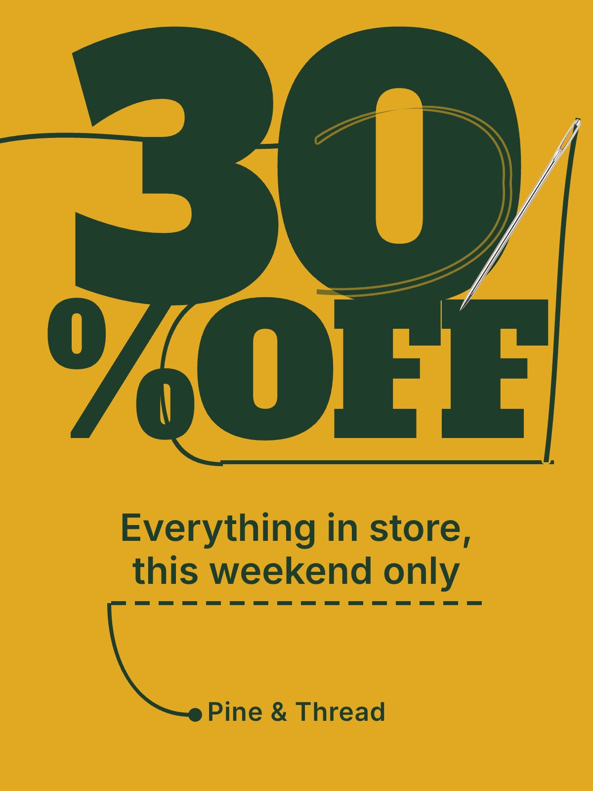
When the discount is the reason to come in, let it fill half the window. "30% OFF" reads from across the street. "Seasonal savings event" doesn't.
Prompt: A shop window sale poster for Pine & Thread boutique with "30% OFF" filling half the poster and "Everything in store, this weekend only" below it on a bold mustard background.
10. The hiring poster that shows the pay
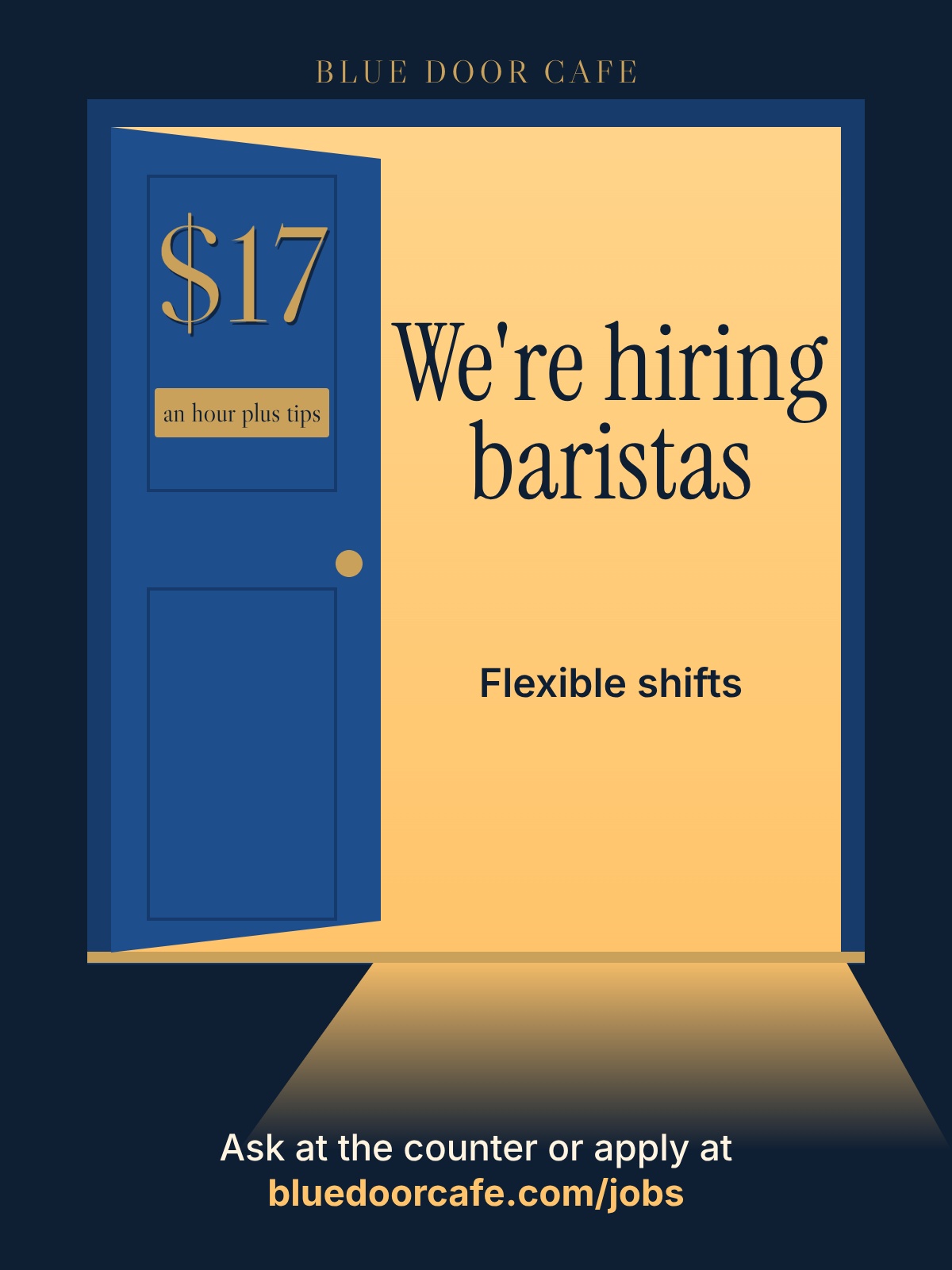
Put the hourly rate in the headline area. Applicants skip posters that hide it, and a counter poster with "$17 an hour plus tips" does the screening for you. For more layouts, see our hiring poster maker.
Prompt: A "We're hiring" poster for Blue Door Cafe looking for baristas at $17 an hour plus tips, flexible shifts, with "Ask at the counter or apply at bluedoorcafe.com/jobs" at the bottom.
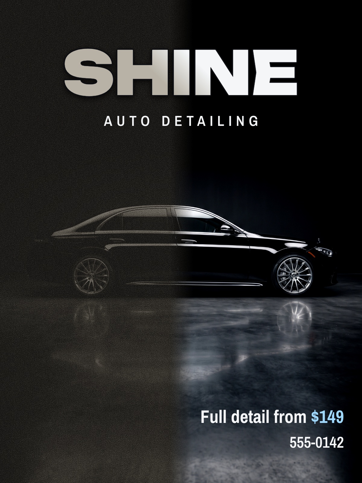
11. Before and after
Split one image down the middle: the problem on the left, your work on the right. For detailers, cleaners, salons and repair shops, the result is the whole pitch.
Prompt: A split before-and-after poster for Shine Auto Detailing showing a dull car on the left and a glossy car on the right, with "Full detail from $149" and the phone number 555-0142.
12. The QR code with a reason
A bare QR code gets ignored. A QR code next to "Scan to book a table tonight" gets scanned, because the promise is right there. Here's how to add a QR code that people actually scan.
Prompt: A restaurant window poster for Olive & Vine with "Scan to book a table tonight" next to a large square space for a QR code, plus "Fresh pasta, Tuesday to Sunday, 5 to 10 pm".
13. The maker behind the counter
A portrait of the person who bakes the bread or fixes the bikes, with their first name and one line. People buy from people, and a face makes a small shop feel like a neighbor. Use a real photo here, not a stock one.
Prompt: A counter poster for Spoke & Chain bike repair with a photo of the owner holding a wrench, the line "I'm Dana. I'll have your bike back by Friday." and the shop hours.
14. The seasonal swap
Keep one layout and change the colors and the line each season. Regulars learn that the window means news, and you get four posters for the effort of one.
Prompt: A cafe window poster announcing "The fall menu is here: maple latte, pumpkin bread and apple cider" in warm autumn colors, with "Until November 30" at the bottom.
School and club poster ideas
Hallway posters fight for attention between classes. Students give them about as long as it takes to walk past, so one idea and one big line win. If you make these every week, our guide to graphic design for schools and PTAs covers the tools.
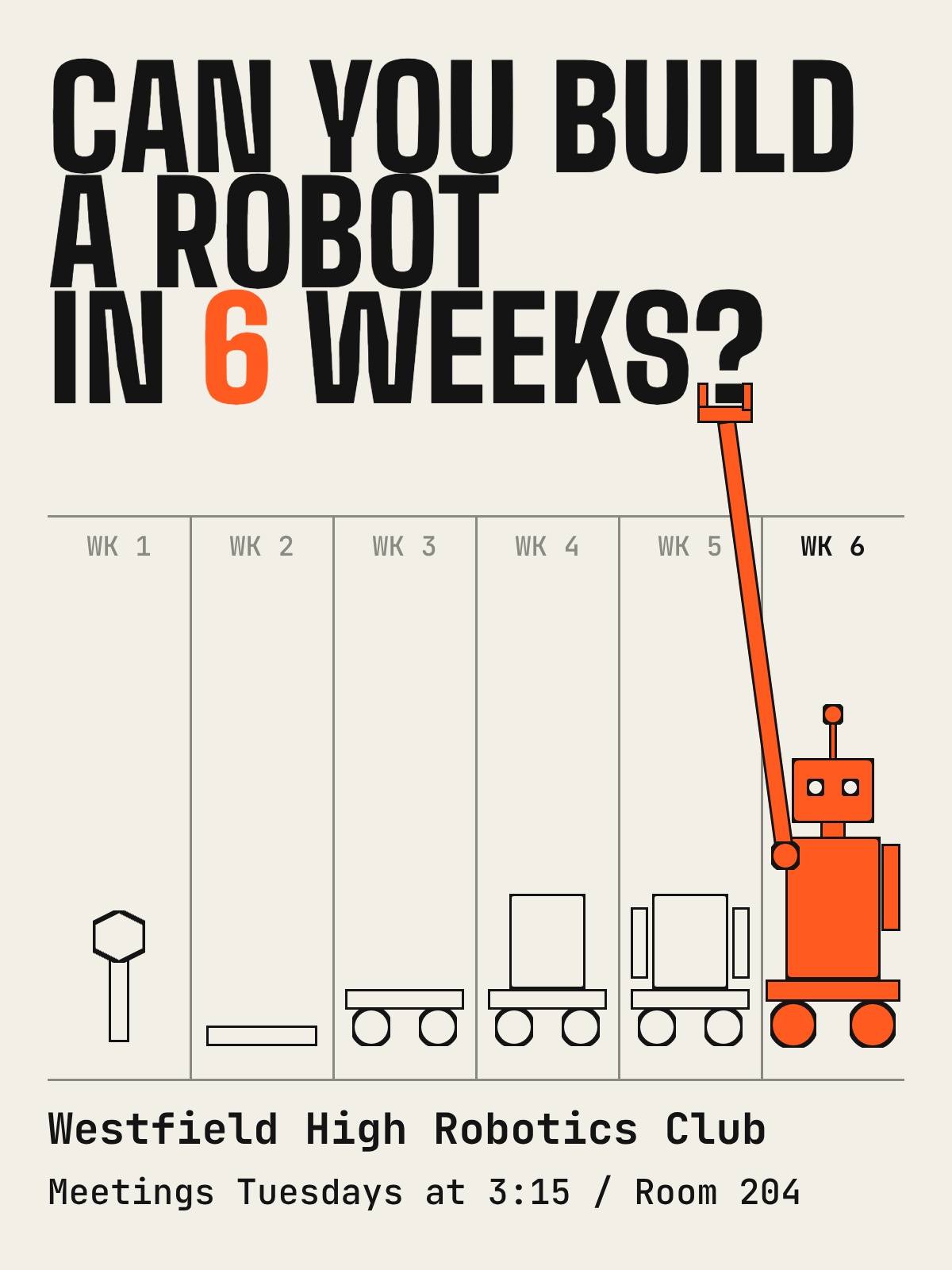
15. The challenge question
Ask a question that dares the reader. "Can you build a robot in 6 weeks?" recruits better than "Robotics Club, all welcome", because it sells the outcome, not the meeting.
Prompt: A school club recruitment poster asking "Can you build a robot in 6 weeks?" for the Westfield High Robotics Club, meetings Tuesdays at 3:15 in Room 204.
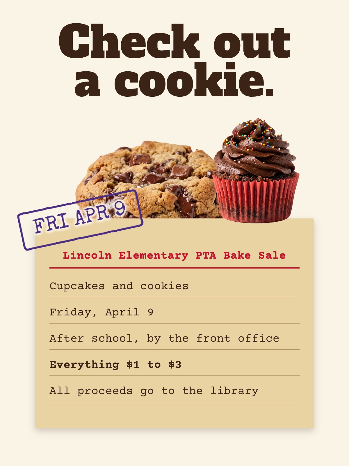
16. The bake sale with prices
Show the food and the price range, and say where the money goes. Parents carry exact change when they know it's "$1 to $3", and "for the library" turns a snack into a reason.
Prompt: A bake sale poster for the Lincoln Elementary PTA on Friday, April 9, after school by the front office, with cupcakes and cookies and "Everything $1 to $3, all proceeds go to the library".
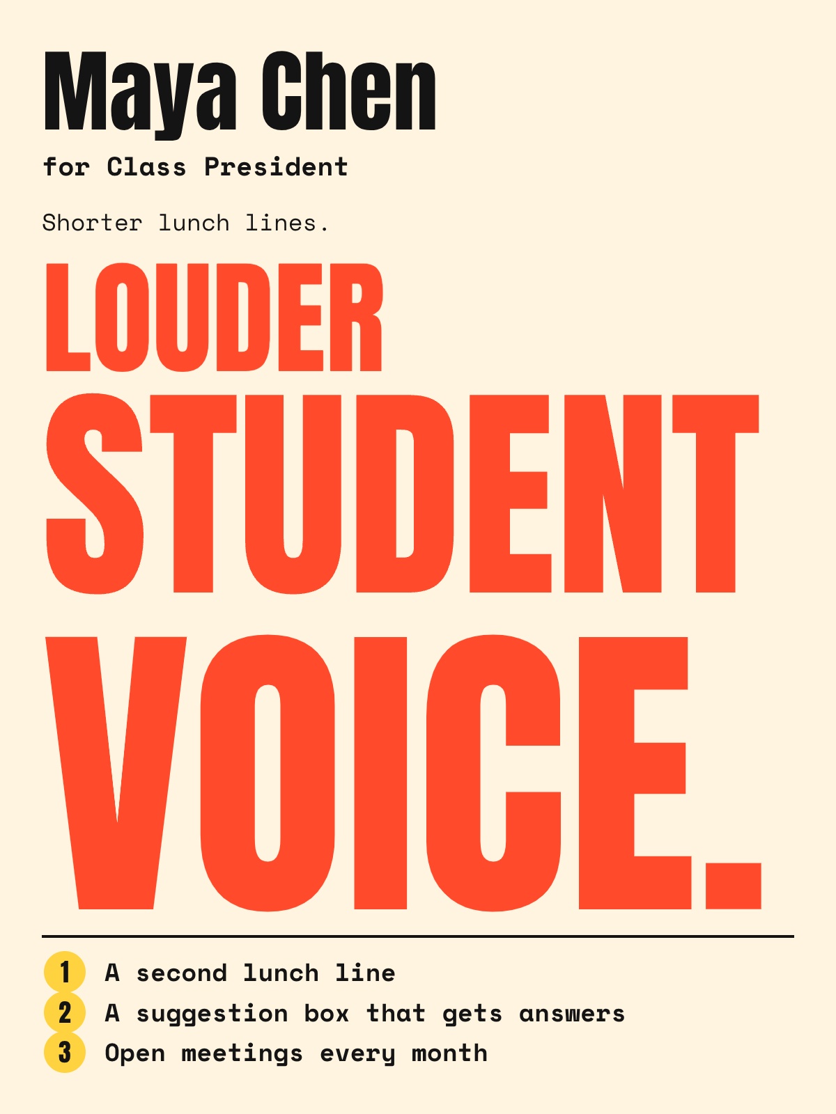
17. The student council poster: name, position, promises
Your name is the biggest thing, the position sits right under it, and three short promises do the convincing. Voters look for the name on the ballot, so that's what they need to remember.
Prompt: A student council campaign poster for "Maya Chen for Class President" with the slogan "Shorter lunch lines. Louder student voice." and three promises: a second lunch line, a suggestion box that gets answers, and open meetings every month.
18. The senior night poster
One athlete, one number, one big photo, and their years on the team. Families keep these, so make the name huge and the photo the real thing.
Prompt: A senior night poster for Ridgeview Volleyball with a large action photo of #12 Jordan Ellis, "4 seasons, 1 team, 0 quit" as the headline, and "Senior Night, Friday, October 22, 6 pm".
19. The game day poster
The matchup is the headline, the time is the subhead, and the school colors do the rest. For the social versions, see our guide to game day graphics.
Prompt: A game day poster with "Westfield vs. Lakeside" as the headline, "Friday, 7 pm, Home Field" below it, a football on a dark field, and Westfield's green and gold.
20. The graduation open house
Lead with the graduate's name and photo, then the date, time and address. Guests need to find the house, so the address is bigger than you think it should be.
Prompt: A graduation open house poster for "Congrats, Ava Morales, Class of 2027" with a cap-and-gown photo, Saturday, June 5, 2 to 5 pm at 118 Birch Lane.
Prom and dance poster ideas
Homecoming, prom, winter formal and the promposals in between. These posters have one job: sell tickets before the deadline. The theme is the hook, the date and price close the deal.
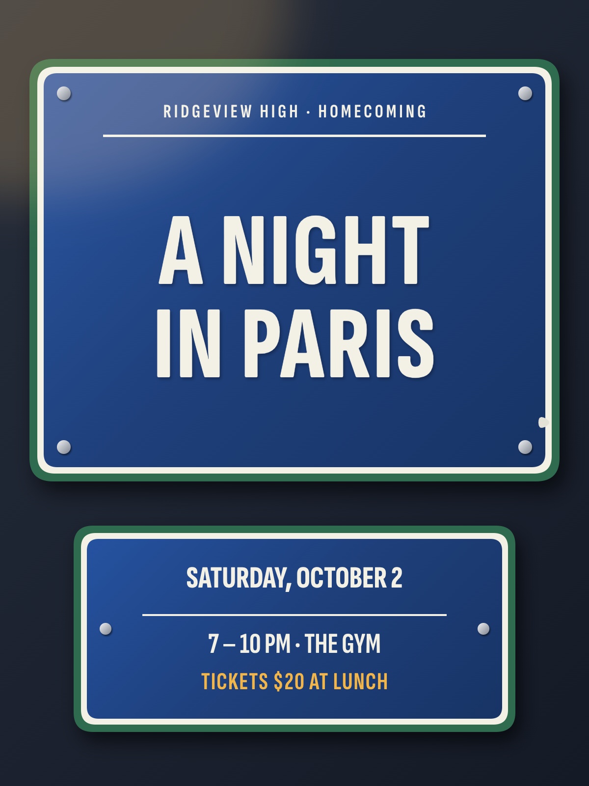
21. The homecoming theme poster
Turn the theme into one strong image and keep the logistics tight at the bottom. "A Night in Paris" sells itself the moment the page looks like Paris.
Prompt: A homecoming dance poster for Ridgeview High with an "A Night in Paris" theme, Saturday, October 2, 7 to 10 pm in the gym, tickets $20 at lunch.
22. The prom theme reveal
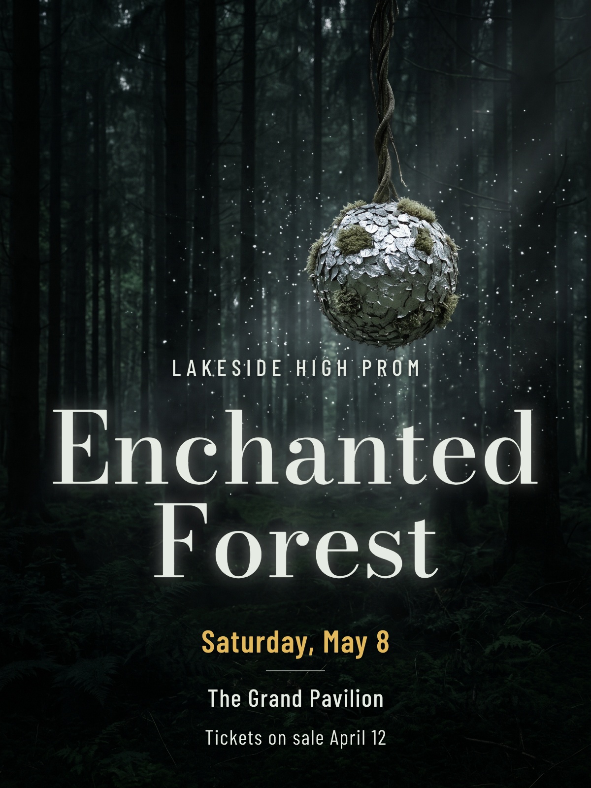
Announce the theme as if it's a movie title, with one moody image behind it. The reveal poster builds talk weeks before tickets go on sale.
Prompt: A prom poster announcing the "Enchanted Forest" theme for Lakeside High Prom on Saturday, May 8, at the Grand Pavilion, with tickets on sale April 12.
23. The promposal
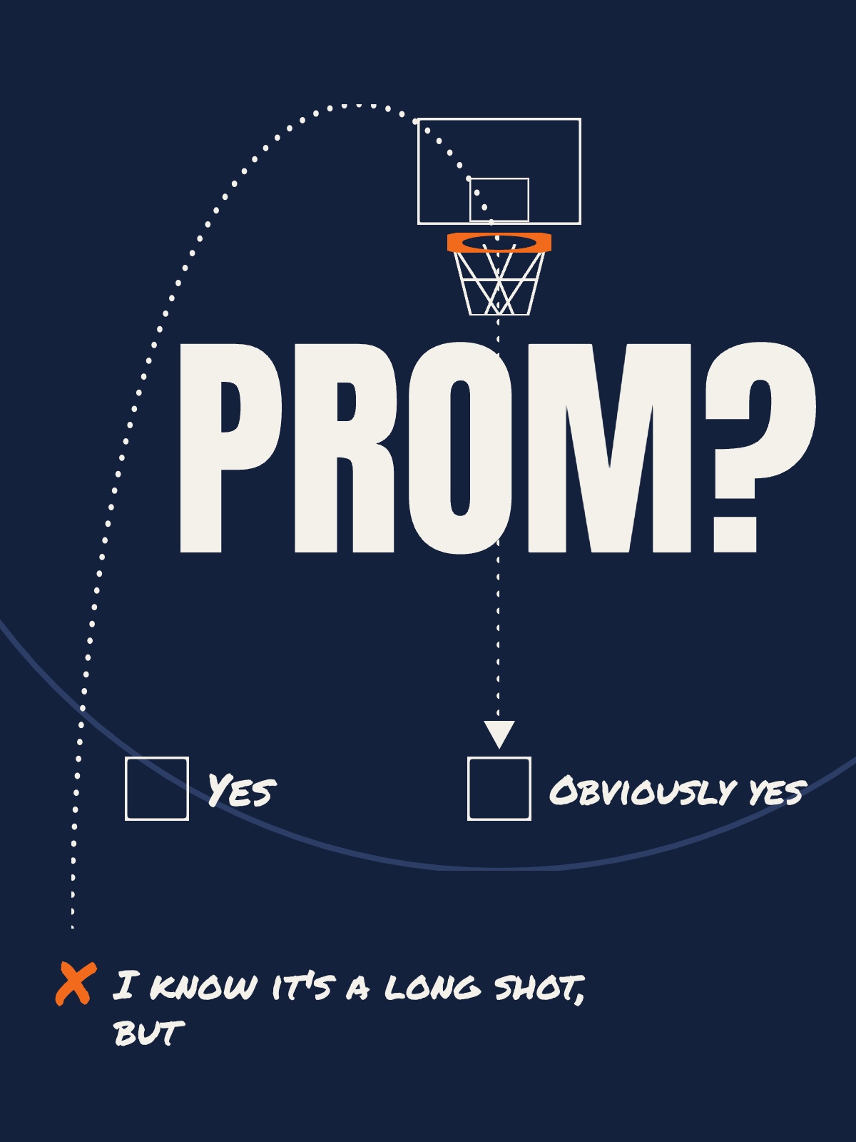
A joke tied to the person, a big "PROM?" and two checkboxes. The checkboxes make it easy to say yes, and the joke makes it a story worth telling.
Prompt: A promposal poster that reads "I know it's a long shot, but PROM?" with a basketball hoop illustration and two checkboxes labeled "Yes" and "Obviously yes".
24. The last call for tickets
A deadline poster with the last day as the headline. Students put off buying until they see "Friday is the last day", so give them that line in letters they can read from the cafeteria door.
Prompt: A prom ticket deadline poster with "LAST DAY FOR TICKETS: FRIDAY" as the headline, "$45 at lunch in the main hall, no tickets at the door" below, in gold on navy.
25. The spirit week schedule
Five days, five dress-up themes, one grid. Students photograph it and check it every morning, so make each day easy to find.
Prompt: A homecoming spirit week poster with a five-day grid: Monday Pajama Day, Tuesday Twin Day, Wednesday Decades Day, Thursday Jersey Day, Friday Blue and Gold Day.
Wall art poster ideas
A poster on your own wall gets seen hundreds of times, so it can be quieter and reward a second look. Fewer words, more feeling.
26. One line you live by
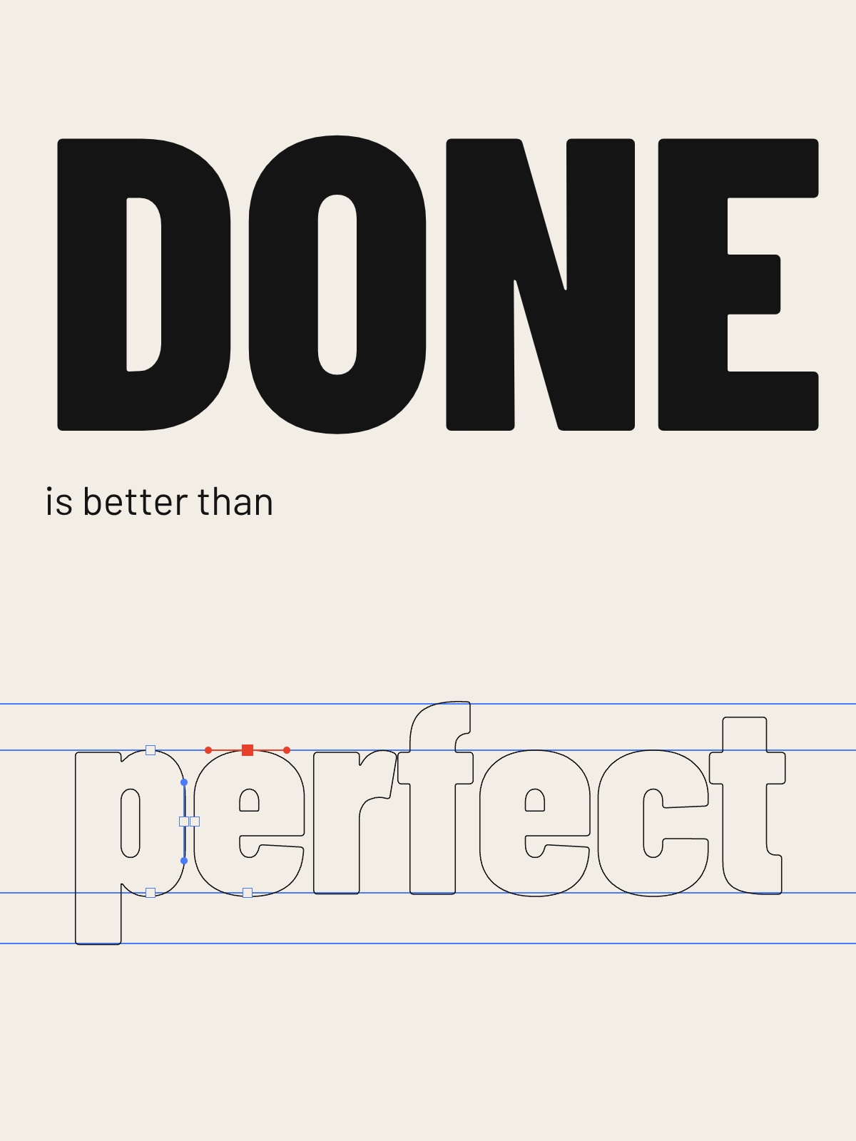
Your favorite sentence in huge type, with lots of space around it. Short phrases and slogans aren't protected by copyright, according to the U.S. Copyright Office, so a one-liner is fair game. A whole song verse is a different story.
Prompt: A minimalist typographic wall poster with the words "Done is better than perfect" in huge bold letters on an off-white background.
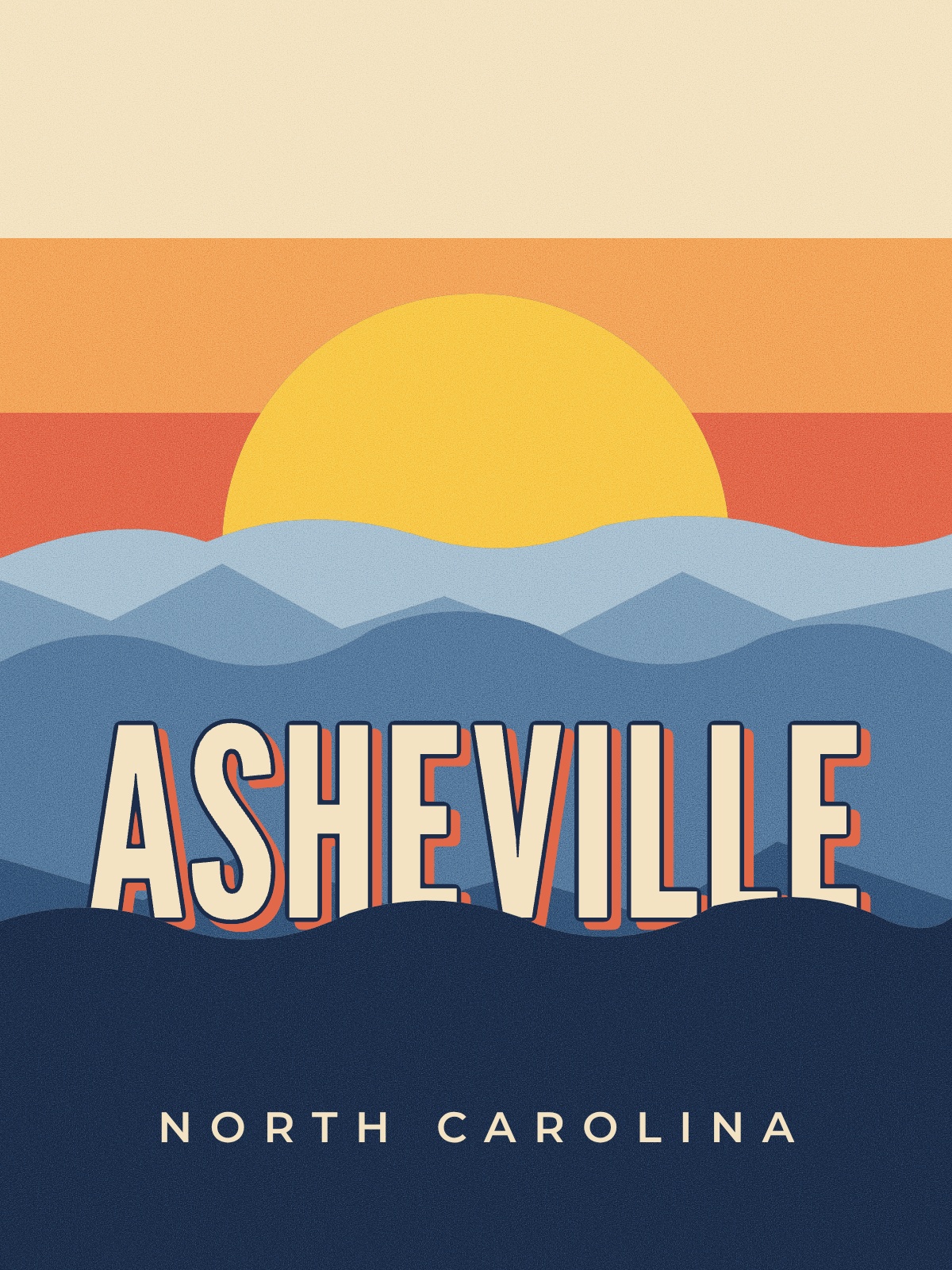
27. The retro travel poster
Your city, or the place you went last summer, in flat 1950s screen-print colors. It's personal without being a photo, and it looks right framed in any room.
Prompt: A retro travel wall poster for Asheville, North Carolina, with layered blue mountains at sunset in a flat 1950s screen-print style.
28. The family recipe
Grandma's recipe set like a page from a cookbook, for the kitchen wall. It's the gift people cry over, and it costs one print.
Prompt: A kitchen wall poster of "Nana Rosa's Sunday Meatballs" with the ingredients in a neat left column, five numbered steps on the right, and a small drawing of a pot on a cream background.
29. The Swiss grid study
Circles, bars and a few words on a strict grid. It works in an office or a studio because it looks designed without asking anything of the viewer.
Prompt: A Swiss-style geometric wall poster with a large red circle, three black bars on a strict grid, and the word "FOCUS" in small lowercase type at the bottom left, on white.
30. The big initial
One letter, cropped and huge, in a color that matches the room. It's an easy win for a kid's bedroom or a nursery.
Prompt: A kids' room wall poster with a giant lowercase "m" in soft coral filling the page, cropped at the right edge, with the name "Mila" small at the bottom.
What every poster needs
Run any of the 30 ideas through this before you print. It takes two minutes and saves a reprint.
- What, when and where in one block. Name the event, the date and time, and the place together, usually near the bottom. People hunt for that block, so don't scatter it.
- One focal point. One element far bigger than the rest. Squint at your poster: whatever you still see is what people will see. The Nielsen Norman Group calls this the squint test for visual hierarchy.
- Letters big enough for the distance. The ADA sign standard (table 703.5.5) asks for capital letters at least 5/8 inch tall when read from under 6 feet, plus 1/8 inch for every foot beyond that. That works out to about 1 1/8 inch at 10 feet for text at eye level. It's written for permanent signs, but it's a solid floor for your headline and your date.
- Enough contrast. Dark on light or light on dark. The web's accessibility standard asks for a contrast ratio of at least 4.5 to 1 for normal text and 3 to 1 for large text. Thin white type over a busy photo fails both.
- One action. Buy at lunch, scan to book, call 555-0142. If you list three actions, people take none.
- The right size for the wall. 11 x 17 inches for a corkboard, 18 x 24 for a hallway or window. Our poster size guide has the pixel sizes for each.
How we made the 16 example posters
Every example above came from the single sentence printed above it. We typed that sentence into Krumzi under a plain brand with no logo, colors or fonts set, waited, and exported what came back. No templates, no hand-built layouts.
Fourteen of the 16 sentences gave a poster we'd print on the first try. Two didn't. The festival lineup came back upside down, with the headliner at the bottom instead of the top. The car detailing poster showed one car half in shadow, not a dull car next to a shiny one. We ran both sentences again, word for word, and the second runs are what you see above. That's the honest catch: the AI sometimes reads a layout differently than you meant. When it does, run it again, or say the layout plainer ("headliner biggest, at the top").
Across all 18 runs, the median poster used 99 AI credits (the cheapest used 69, the priciest 274). At that median, the 1,000 credits in Krumzi's free trial cover about 10 posters.
Want your own logo, colors and fonts on every poster? Save them once in a Brand Kit (Pro and up) and Krumzi designs in them from the same sentence.
Turn any idea here into a poster with Krumzi
If you'd rather not build the poster by hand, Krumzi turns your sentence into a finished, editable design. The AI lays it out from scratch, so it isn't a template with your words dropped in.
- Write one sentence. Pick an idea above and swap in your name, date, place and price. Put any exact wording in quotes.
- Let Krumzi design it. The free AI poster maker gives you one poster a week with no signup. It usually takes 1 to 3 minutes, and the download carries a small watermark.
- Fix what you want, then print. Every word is real text, so you change a date in a second instead of starting over. Download it and take it to your printer.
If you want the full walkthrough, from brief to print file, read how to design a poster with AI. Comparing tools first? Our list of the best AI poster makers tests eight of them.
Krumzi pricing (Verified November 19, 2026, on krumzi.com/pricing): Starter is $19 a month with 1,000 AI credits. Pro is $39 a month with 2,500 credits, 3 brands and the Brand Kit. Studio is $89 a month. Yearly billing gets two months free. Starter, Pro and Studio start with a 3-day free trial with 1,000 AI credits and watermarked exports; a card is needed and the plan renews after 3 days unless you cancel. Need it for one event? A month pass gives you everything in Pro for 30 days for $49 once, and nothing renews.
When you should use something else
Krumzi isn't the right tool for every poster on this list. Here's when something else wins.
- When handmade is the point. A promposal or a campaign poster in markers on poster board says "I made this for you" in a way no print does.
- When you want to browse before you decide. If you'd rather scroll thousands of ready-made looks and pick one by eye, a template library like Canva, Adobe Express or PosterMyWall suits you better. Eligible K-12 teachers and students get Canva Education free.
- When the poster is one giant print. For a 24 x 36 foam board or a banner, your local print shop's in-house designer can set up the file to their exact press and take responsibility for both design and print.
- When it's a whole festival identity. A poster that has to match tickets, wristbands, stage banners and twenty social posts for a season is a job for a hired designer who owns the system.
- When one photo is everything. For the maker portrait or a senior night poster, a good photographer matters more than any layout. No design tool fixes a dark, blurry photo.
Your next poster
Pick the group that matches your wall, choose one idea, and write your sentence with the real name, date, place and price in it. That sentence is most of the work.
Want the design part done for you? Start free trial and describe your first poster.
3-day free trial, card needed. No charge until day 4. Cancel online anytime.
Frequently Asked Questions
What are some creative ideas for posters?
Strong creative poster ideas include a giant date, a ticket stub layout, a lineup ladder, a single object with one number, a before-and-after split and a question set in huge type. The best one depends on where the poster hangs. Events lead with the date or the headliner, shops lead with the offer, and wall art can be quieter.
What should I put on a poster?
Put what it is, when it happens, where it happens and one action, such as "tickets $20 at lunch." Make the most important of those the biggest thing on the page, and group the rest in one block. Cut anything a reader doesn't need to act.
How do I make my poster stand out?
Make one element far bigger than everything else and leave empty space around it. Use strong contrast and a color the posters around yours aren't using. Then squint at it from across the room: if the main message still reads, it stands out.
What size should a poster be?
The most common sizes are 11 x 17 inches for corkboards and counters and 18 x 24 inches for hallways and windows, with 24 x 36 for big displays. Design at the final print size so text stays sharp. Our poster size guide lists the pixel dimensions for each.
What are good poster ideas for school?
Good school poster ideas include a club recruitment poster built around a challenge question, a bake sale poster with prices and a cause, a student council poster with your name, position and three promises, and senior night or game day posters. For dances, a theme reveal and a ticket deadline poster sell the most tickets. Keep every school poster readable from across a hallway.
Can AI make a poster for me?
Yes. Tools like Krumzi, Canva and Adobe Express can make a poster from a short description. Krumzi designs it from scratch and keeps every word as editable text, so you can fix the date without starting over. Write the real details into your prompt and you'll get a poster you can print.
A month of posts, designed before your coffee cools
Describe the post. Krumzi designs it from scratch, on your brand, fully editable.
Start free trial3-day free trial, card needed. No charge until day 4. Cancel online anytime.