
Your thumbnail is the single biggest lever you control on YouTube, and getting the size wrong quietly wrecks it. Upload something too small and it turns to mush on a living room TV. Put text in the wrong corner and the video duration badge lands right on top of it.
Here is what changed: YouTube now recommends a far larger thumbnail than the 1280x720 everyone has quoted for a decade, and the file size cap jumped dramatically on desktop. Most guides still ranking for this were written before that update.
Below you will find the exact YouTube thumbnail size for 2026, the file limits that actually apply to your upload method, the safe zones nobody talks about, and a fast way to produce one that holds up at every size.
YouTube Thumbnail Size in 2026: The Quick Answer
The recommended YouTube thumbnail size is 3840 x 2160 pixels (4K UHD) at a 16:9 aspect ratio. The long-standing 1280 x 720 pixels is still valid and remains the practical baseline for most creators. The absolute minimum width is 640 pixels.
| Spec | Value |
|---|---|
| Recommended resolution | 3840 x 2160 px (4K UHD) |
| Standard resolution | 1280 x 720 px |
| Minimum width | 640 px |
| Aspect ratio | 16:9 |
| File formats | JPG, PNG, GIF |
| Max file size, desktop upload | 50 MB |
| Max file size, mobile video | 2 MB |
| Max file size, mobile podcast | 10 MB |
If you remember one thing: design at 1920 x 1080 or larger, keep the 16:9 ratio, and upload from desktop so you are not squeezed by the 2 MB mobile cap.
Why YouTube Raised the Recommended Size

For years, 1280 x 720 was the answer to every thumbnail question. It made sense when almost everyone browsed YouTube on a phone or a laptop.
That is not where the growth is anymore. Living room viewing has become one of YouTube's fastest-growing surfaces, and a 1280 x 720 image stretched across a 65-inch 4K panel looks noticeably soft. The browse shelf on a TV renders thumbnails far larger than any phone ever will.
So the guidance moved up to 4K, and the desktop file cap moved from 2 MB to 50 MB to make room for that detail. Higher-resolution source files also survive YouTube's compression better, which matters because YouTube re-encodes every thumbnail you upload.
Here is the practical read: you do not need to jump to 4K to compete. You do need to stop designing at 1280 x 720 and exporting a 200 KB JPG, because that combination is now the low end of the range rather than the standard.
The Only Aspect Ratio That Matters: 16:9
Every YouTube thumbnail is 16:9. Not 4:3, not square, not vertical.
If you upload an image at a different ratio, YouTube will letterbox or crop it, and neither result looks intentional. Black bars on the sides read as an amateur upload before anyone has watched a second of your video.
Common 16:9 sizes that all work:
- 1280 x 720 (720p, the baseline)
- 1920 x 1080 (1080p, the sweet spot for most creators)
- 2560 x 1440 (1440p)
- 3840 x 2160 (4K, the current recommendation)
My honest recommendation for most people: design at 1920 x 1080. It is high enough to look crisp on a TV, small enough to keep file sizes sane, and it doubles as a usable size for other platforms.
File Size Limits Depend on Where You Upload From
This is the detail that trips people up, because the answer is not one number.
| Upload method | Content type | Limit |
|---|---|---|
| Desktop | Video thumbnail | 50 MB |
| Desktop | Podcast thumbnail | 50 MB |
| Mobile app | Video thumbnail | 2 MB |
| Mobile app | Podcast thumbnail | 10 MB |
If you design a detailed 4K thumbnail and try to set it from your phone, you will hit the 2 MB wall and have no idea why. Upload from a desktop browser instead.
And a caution on the 50 MB ceiling: just because you can upload a 40 MB PNG does not mean you should. YouTube compresses it anyway, and a bloated file adds nothing but load time. A well-exported 1920 x 1080 PNG usually lands between 500 KB and 3 MB, and that is plenty.
Safe Zones: Where Not to Put Anything Important
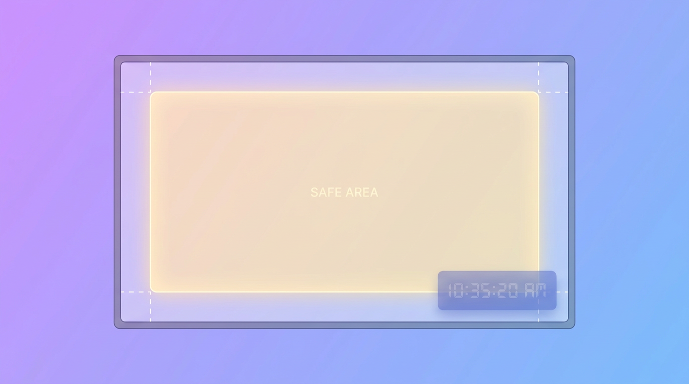
Your thumbnail is never displayed clean. YouTube overlays interface elements on top of it, and they land in predictable places.
Bottom-right corner. The video duration badge sits here on essentially every surface. Keep the bottom-right roughly 15 percent free of faces, text, and logos. This is the single most common thumbnail mistake.
Bottom edge. On a video the viewer has partially watched, a red progress bar covers the bottom few pixels. Keep nothing critical in the bottom 5 percent.
Bottom-left corner. In some feeds and on the watch page, hover controls and metadata crowd this area. Treat it as semi-safe.
Right edge on TV. Some living room layouts crop slightly on the sides. Keep your subject away from the outermost edges.
The practical rule: build your composition inside the middle 80 percent of the frame. Anything outside that is decoration, not information.
Design for the Smallest Size, Not the Largest

Here is where most creators get it backwards. They design a beautiful thumbnail at full size on a big monitor, then wonder why it disappears in the feed.
Your thumbnail competes at roughly 210 x 118 pixels in the YouTube sidebar and search results. That is smaller than a postage stamp.
What survives at that size:
- Three to five words maximum. Six words is already too many. Two or three is better.
- Text at 90 pt or larger when working on a 1920 x 1080 canvas.
- One clear focal point. One face, one object, one contrast. Not a collage.
- High contrast. Light subject on dark background, or the reverse. Mid-tone on mid-tone vanishes.
- Faces with a readable expression. Surprise, tension, and delight read at tiny sizes. Neutral does not.
The test that actually works: export your thumbnail, then shrink it to 210 pixels wide and look at it on your phone from arm's length. If you cannot tell what the video is about in one second, redo it. Every serious creator does some version of this check.
File Format: PNG or JPG?
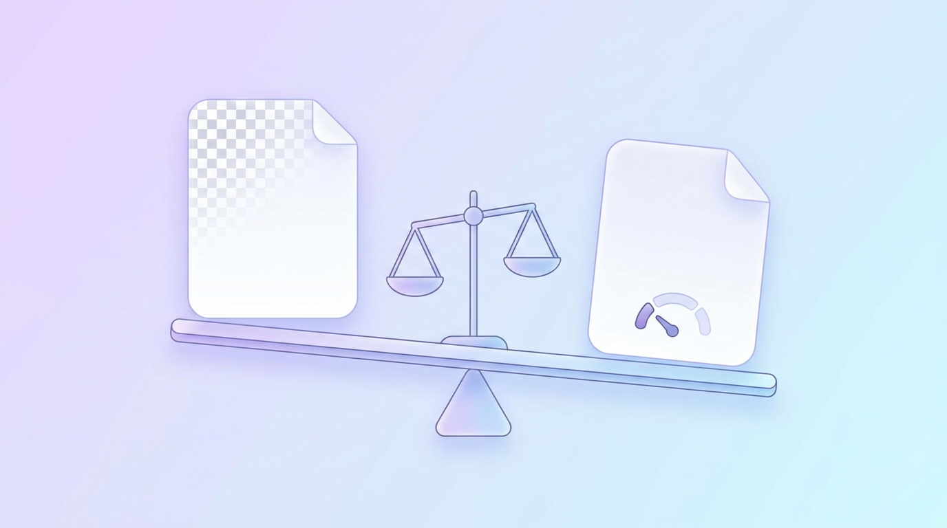
Both work. The choice depends on your design.
Use PNG when your thumbnail is text-heavy, has sharp graphic edges, flat colors, or a logo. PNG keeps text crisp with no compression artifacts around the letters.
Use JPG when your thumbnail is mostly photographic with soft gradients and no large text blocks. You will get a much smaller file at effectively the same visual quality.
Skip GIF. YouTube technically accepts it, but thumbnails do not animate, so you get worse color depth for no benefit.
If you are unsure, export PNG. With a 50 MB desktop budget, there is no reason to be stingy.
How to Make a Correctly Sized Thumbnail Fast
The specs are the easy part. Producing a thumbnail that is both correctly sized and actually good is where the time goes, especially if you publish weekly.
A fast workflow that respects everything above:
- Start at 1920 x 1080. It satisfies the 16:9 requirement and gives you resolution headroom.
- Block out the safe zones first. Draw a rectangle over the bottom-right 15 percent as a reminder before you place anything.
- Place your focal point off-center. Subject on one side, text on the other reads better at small sizes than a centered composition.
- Set your text at 90 pt or larger and cut the copy until it fits comfortably.
- Shrink-test it at 210 pixels wide before exporting.
- Export as PNG and upload from desktop.
If you would rather skip the canvas setup entirely, Krumzi generates the whole thumbnail from a description. You say what the video is about and the AI builds the layout, contrast, and typography at the right dimensions, then every element stays editable so you can nudge the text or swap the background. It is a reasonable shortcut when you are shipping several videos a week and thumbnail design is the bottleneck.
For a deeper walkthrough of the design side rather than the specs, see our guide on how to make a YouTube thumbnail that gets clicks. If you want to compare dedicated tools, we tested nine of them in the best AI YouTube thumbnail makers.
Thumbnail Sizes for Other YouTube Assets
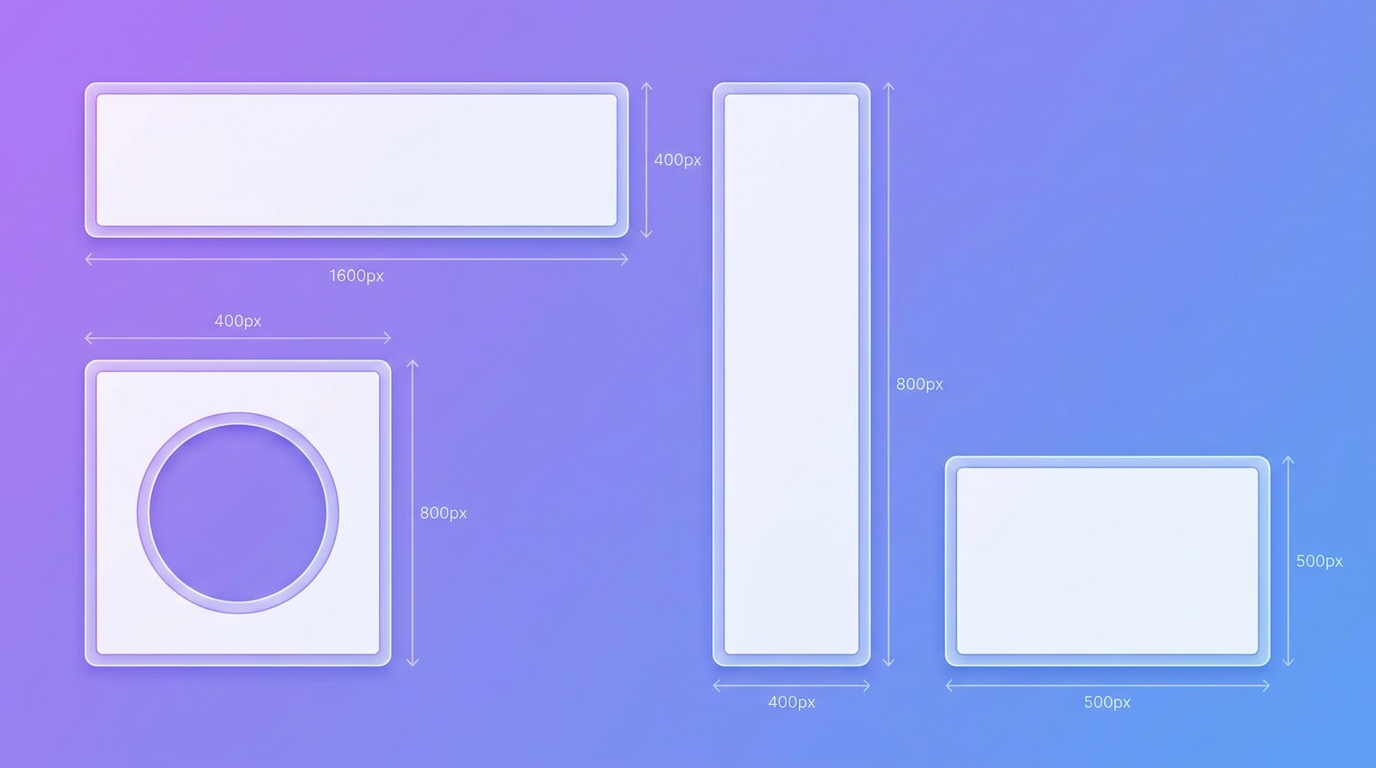
Thumbnails are not the only image YouTube asks you for. The rest of the channel has its own specs:
| Asset | Size | Ratio |
|---|---|---|
| Video thumbnail | 1280 x 720 to 3840 x 2160 | 16:9 |
| Channel banner | 2560 x 1440 | 16:9 |
| Channel profile picture | 800 x 800 | 1:1 |
| Shorts cover | 1080 x 1920 | 9:16 |
| End screen safe area | 1280 x 720 | 16:9 |
The channel banner is the trickiest of these, since it crops differently on TV, desktop, and mobile. We broke that down in how to make a YouTube banner that looks great on every device. For vertical content, the cover specs live in how to make a YouTube Short.
If you publish across several platforms, our complete social media image sizes guide covers every dimension in one place.
Common Thumbnail Sizing Mistakes

Designing at 1280 x 720 and upscaling later. Upscaling adds no detail. Start large and scale down.
Uploading from mobile with a detailed design. The 2 MB cap forces heavy compression. Use desktop.
Text touching the edges. It gets cropped on TV layouts and crowded by interface elements everywhere else.
Using a video frame as the thumbnail. Auto-generated frames are almost always mid-motion, badly lit, and low contrast. A custom thumbnail is the entire point.
Ignoring the duration badge. Faces and words in the bottom-right get covered on every single impression.
Frequently Asked Questions
Is YouTube thumbnail size 1920x1080 or 1280x720?
Both work, because both are 16:9. 1280 x 720 is the traditional baseline and 1920 x 1080 is the better practical choice in 2026, since it stays sharp on TVs and large monitors. YouTube's current recommendation goes further, to 3840 x 2160.
Can I upload a 4K thumbnail to YouTube?
Yes. YouTube recommends 3840 x 2160 and allows files up to 50 MB when you upload from a desktop browser. From the mobile app you are still limited to 2 MB for video thumbnails, so large files need a desktop upload.
What is the minimum YouTube thumbnail size?
The minimum accepted width is 640 pixels. Anything that small will look soft on modern displays, so treat it as a hard floor rather than a target.
Why does my thumbnail look blurry after uploading?
Usually one of three reasons: your source file was under 1280 pixels wide, you uploaded from mobile and hit the 2 MB compression limit, or you exported a heavily compressed JPG. Re-export at 1920 x 1080 as a PNG and upload from desktop.
Does thumbnail file size affect my ranking?
No. File size has no direct effect on how YouTube ranks or recommends your video. It only affects visual quality, which affects click-through rate, which does influence how widely your video gets recommended.
The Short Version
Design at 1920 x 1080 or larger, keep the ratio at 16:9, stay out of the bottom-right corner, export as PNG, and upload from desktop. That covers the specs.
The part that actually moves your numbers is whether the thumbnail reads in one second at postage-stamp size. Get the dimensions right so the design has a chance, then spend your energy on contrast, one focal point, and three words of text.
Ready to build one? Try Krumzi free and describe the video you are publishing.

 Facebook
 X
X LinkedIn


