On this page
- What makes a great magazine cover?
- The parts of a magazine cover
- 6 famous magazine covers, decoded
- The 4 types of magazine covers
- What the best magazine covers have in common
- Magazine cover ideas you can borrow for your social posts
- How to design a magazine cover for your posts
- Where to browse more magazine covers
- Frequently Asked Questions
You've probably screenshotted a magazine cover because it stopped you mid-scroll. Great magazine covers do that on purpose. For decades they've had about a second on a crowded newsstand to win a stranger over, and the best ones still work 50 years later.
That's the same job your carousel's first slide, your Reels cover and your newsletter header do every week. Your feed is the newsstand now.
This guide covers the five parts every magazine cover shares, six famous covers and the one move each teaches, the four types of covers, and how to rebuild the same structure for the covers you post, in your own brand.
What makes a great magazine cover?
A great magazine cover has one focal point, a masthead you recognize at a glance, one headline that clearly dominates, a few short cover lines that promise what's inside, and an image and type that work together, often with the subject overlapping the title. Restraint beats decoration. Every element earns its place or goes.
The parts of a magazine cover
Almost every cover, from Vogue to a local business title, is built from the same five parts. Learn them once and you'll see them everywhere.
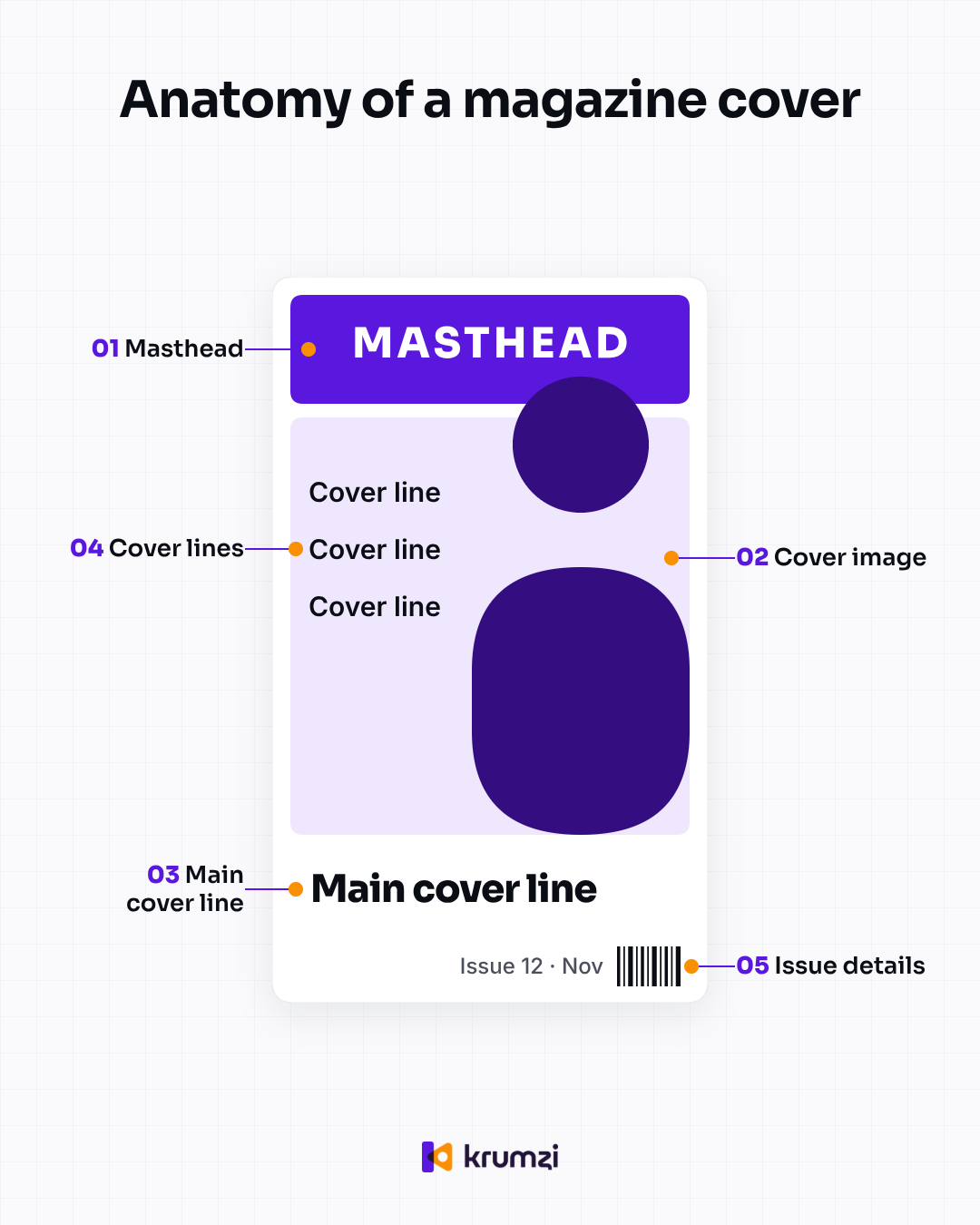
1. Masthead. The magazine's name, usually across the top and usually the biggest type on the page. Its job is recognition: regular readers spot it before they read a word. On social, your masthead is your series name or brand name.
2. Cover image. One subject, usually a person, often looking straight at you. The subject sometimes sits in front of the masthead, partly covering the letters. That small overlap adds depth and tells you the photo matters more than the name.
3. Main cover line. The headline for the issue's big story. It's the one line that clearly wins the type hierarchy, so your eye goes masthead, face, headline in that order.
4. Supporting cover lines. Three to five short promises about what's inside. On a carousel, they're a preview of the next slides.
5. Issue details. The dateline or issue number, plus the barcode on print. For a social series, "Issue 12" or "Week 46" is what turns a one-off post into something followers expect again.
You'll also see a few extras: the skyline (a thin strip of promos above the masthead), the tagline (a short line under the masthead) and the puff (a sticker-style badge like "Special issue").
| Part | Its job in print | Its job on social |
|---|---|---|
| Masthead | Recognition on the newsstand | Your series or brand name |
| Cover image | Stop the eye | The thumbnail that stops the scroll |
| Main cover line | Sell the big story | The post's one promise |
| Cover lines | Sell the rest of the issue | Tease slides 2 to 5 |
| Issue details | Date and price | Issue number that builds a habit |
6 famous magazine covers, decoded
Here are six covers that editors still rank among the best, with the one move each teaches. The images belong to their publishers, so follow the links to see them.
Esquire, April 1968: Muhammad Ali as St. Sebastian
Art director George Lois posed Ali as the martyred saint, shot by photographer Carl Fischer, after Ali was stripped of his title for refusing the draft (Andscape tells the full story). The American Society of Magazine Editors ranked it #3 of the last 40 years in 2005, and T Magazine put it first on its 2025 list.
Borrow this: one idea per cover, not three.
The New Yorker, September 24, 2001: the black towers
Françoise Mouly first thought about running an all-black cover, and Art Spiegelman suggested adding the outlines of the Twin Towers, black on black. ASME placed it #6.
Borrow this: on a serious subject, take things away.
TIME, April 8, 1966: "Is God Dead?"
No photo at all, just three words of type. ASME ranked it #12.
Borrow this: a strong enough line needs no picture, which is great news for text carousels and quote posts.
LIFE, April 30, 1965: Lennart Nilsson's photograph of a fetus
The cover image was the story: an 18-week-old fetus, photographed by Lennart Nilsson. ASME ranked it #11.
Borrow this: when you have a remarkable picture, let it fill the frame and keep the type small.
Rolling Stone, January 22, 1981: John Lennon and Yoko Ono
Annie Leibovitz took the photo hours before Lennon was shot in December 1980. ASME's panel named it the best magazine cover of the previous 40 years.
Borrow this: a real photo of real people beats stock every time.
TIME, April 14, 1997: Ellen DeGeneres, "Yep, I'm Gay"
A portrait by Firooz Zahedi and a headline written the way a person actually talks. It's on ASME's Top 40 list too.
Borrow this: write cover lines in a human voice, not a press-release voice.
The 4 types of magazine covers
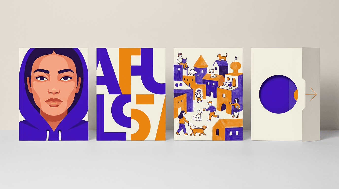
Most covers fall into one of four types, and each maps neatly onto a kind of post.
| Type | What drives it | Best social use |
|---|---|---|
| Portrait or celebrity | A face and eye contact | Creator and team spotlight posts |
| Typographic or minimalist | Big type and empty space | Tips carousels, quotes, announcements |
| Illustrative | Drawn or painted art | Brands with an illustration style |
| Special format | Fold-outs, die-cuts, split covers | Panoramic swipe-across carousels and "cover reveal" posts |
What the best magazine covers have in common
Eye contact. Former photographer Mia Ziervogel, writing in Dossier, says "the eyes need to connect." She also makes the case for the opposite: a subject looking away pulls you into a private world.
Type and image touch. The subject overlaps the masthead, or a headline wraps around a shoulder. Image and words read as one design, not two layers.
Restraint. Ziervogel calls it "such beauty in a simplicity." One accent color and one big idea.
Built for a crowded rack. Old cover rules, like the 1990s editor rule "never use the colour green" that Ziervogel recalls (and questions), came from fighting for attention on a shelf full of rivals. Today, that crowded shelf is your feed.
Magazine cover ideas you can borrow for your social posts
This is where the cover format pays off for creators and social media managers. Each idea below uses the same five parts.

A carousel cover that reads like an issue
Make slide 1 the cover. The masthead is your series name, the main cover line is the post's promise ("5 hooks that stop the scroll"), and three cover lines tease slides 2 to 5. People swipe to collect the promises. A carousel maker gets you the first draft fast.
A Reels cover with a masthead
Put the same series name in the same spot on every Instagram Reels cover, with one face and one headline. Over a few weeks, your profile grid starts to look like a row of issues on a newsstand shelf.
A newsletter header with an issue number
Turn your email header into a small cover: masthead, issue number, and this week's top story as the main line. The issue number does quiet work, because readers notice when they've missed one.
A lead magnet or ebook cover
A guide you give away still gets judged by its cover. Use a clear benefit headline as the main line and two cover lines that list what's inside. Here's how to design an ebook people actually finish.
A monthly "issue" for each client
If you post for clients, a monthly roundup in cover format (wins, launches, team news) gives each client a recurring post that looks premium. Same structure every month, in each client's own brand.
A "cover star" spotlight
Launches, milestones and team introductions all suit a portrait cover: one person, eye contact, a masthead and a single line about why they're on the cover this week.
How to design a magazine cover for your posts
Here's the five-step version for a social cover.
1. Name your masthead once and keep it
Pick a short series name, set it in your brand font, and put it in the same position every time. Recognition comes from repetition, so don't redesign it each week.
2. Pick the right size
For a feed post or carousel cover, use 1080 x 1350 px (4:5). Our Instagram carousel size guide covers the other options. For a Reels or Story cover, use 1080 x 1920 px (9:16). For print, many US magazines trim at about 8.375 x 10.875 in, and US Letter (8.5 x 11 in, or 2550 x 3300 px at 300 dpi) is the common stand-in, plus a 0.125 in bleed.
3. Choose one image and place the subject
Pick a photo with one clear subject, ideally with eye contact, and room at the top for the masthead. If the head can overlap the bottom of the masthead, let it.
4. Write one headline and three cover lines
Make the headline two to three times the size of the cover lines, so there's no doubt which one wins. Keep every line concrete and in your reader's words.
5. Add the issue details, then reuse the layout
Add the issue number or date. Next week, change the image and the lines and keep everything else, so your series is recognizable before anyone reads it. That reusable layout becomes your own magazine cover template, made for your brand rather than borrowed.

Make your weekly cover with Krumzi
Doing this by hand every week is a lot. With Krumzi, you describe the cover in plain words: the masthead name, one headline, three cover lines and the issue number. Krumzi designs it from scratch in your brand, not from a template, and every element stays fully editable. It can even place your photo's subject in front of the title, the way magazines do.
Next week, ask for new lines and a new photo and keep the look. Turn the same cover into carousel slide 1 and a Reels cover, so the whole series stays in one style. The cover above was made exactly this way.
Start free trial (card needed, charged on day 4). For a one-off cover, try the free poster maker: no signup, one free design a week, downloaded with a watermark.
Where to browse more magazine covers
- ASME's Top 40 Magazine Covers: the 2005 editors' list, with context for each pick.
- TIME Vault: every TIME issue and cover.
- Coverjunkie: a curated showcase of new and classic covers.
- T Magazine's 25 most influential covers (2025): a newer editors' pick.
Borrow the structure, not the brand. Don't put a real magazine's name, masthead or logo on your posts. Those are trademarks.
Frequently Asked Questions
What are the parts of a magazine cover?
A magazine cover has five core parts: the masthead (the title), the main image, the main cover line, supporting cover lines, and issue details such as the date and barcode. Many covers also add a skyline, a tagline under the masthead, or a puff badge.
What size is a magazine cover?
There's no single standard, but many US magazines trim at about 8.375 x 10.875 inches, and US Letter (8.5 x 11 inches) is the common stand-in. For social media covers, use 1080 x 1350 px for feed posts and carousels and 1080 x 1920 px for Reels and Stories.
What is the most famous magazine cover of all time?
In 2005, the American Society of Magazine Editors named Rolling Stone's January 22, 1981 cover of John Lennon and Yoko Ono, shot by Annie Leibovitz, the top cover of the previous 40 years. T Magazine's 2025 list put Esquire's April 1968 Muhammad Ali cover first.
Can I use a magazine cover style for my brand's posts?
Yes. The layout and structure (masthead, one image, a headline and cover lines) are fair game. What you can't use is a real magazine's name, masthead or logo, or a copied cover photo.
How do I make a magazine-style cover for Instagram?
Pick a series name as your masthead, use a 1080 x 1350 px canvas, and choose one photo with a clear subject. Add one big headline and three short cover lines, then an issue number. Keep the layout the same every week so followers recognize the series.
A month of posts, designed before your coffee cools
Describe the post. Krumzi designs it from scratch, on your brand, fully editable.
Start free trial3-day free trial, card needed. No charge until day 4. Cancel online anytime.