
Your LinkedIn banner is the biggest piece of visual real estate on your profile, and most people leave it as the default blue gradient. That is a missed opportunity. A well-designed banner tells visitors who you are and what you do before they read a single word, but only if it is the right size. Get the dimensions wrong and LinkedIn crops your text, squishes your logo, or blurs the whole thing.
This guide gives you the exact LinkedIn banner size for 2026, the safe zones that keep your content from being cut off, and a simple way to design a banner that looks sharp on every device.
LinkedIn Banner Size: The Quick Answer
The recommended LinkedIn banner size for a personal profile is 1584 x 396 pixels, a 4:1 aspect ratio. That is the size that fits LinkedIn's layout cleanly without stretching or cropping.
Company pages use a different size, and there are a few other image dimensions worth knowing. Here is the full breakdown.
| Image type | Recommended size | Aspect ratio |
|---|---|---|
| Personal profile banner | 1584 x 396 px | 4:1 |
| Company page cover | 1128 x 191 px | ~6:1 |
| Company page (high-res) | 4200 x 700 px | 6:1 |
| Profile photo | 400 x 400 px | 1:1 |
For personal profiles, 1584 x 396 is the number to remember. For company pages, LinkedIn officially recommends a larger 4200 x 700 image, which keeps things crisp on high-resolution screens, though the older 1128 x 191 still works.
File Format and Size Rules
Before you design, know the technical limits:
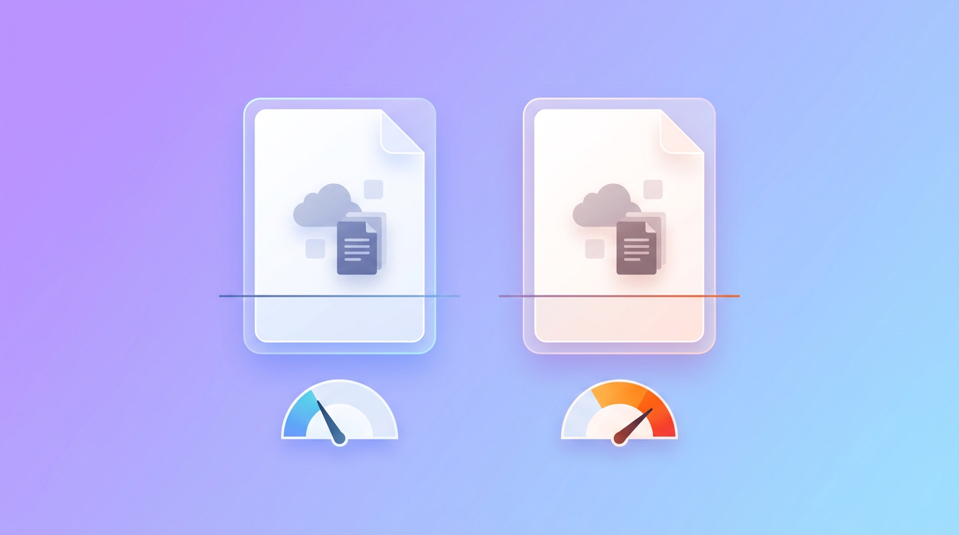
- Format: JPEG or PNG. Use PNG if your banner has text or a logo, since it keeps edges crisp. Use JPEG for photo-heavy banners.
- Maximum file size: Up to 8 MB for a personal banner.
- Resolution: Start at 300 DPI or higher so the image does not pixelate on large monitors.
Designing at the exact pixel size from the start saves you from upload headaches later.
Safe Zones: Where Not to Put Important Content
This is the part almost everyone gets wrong. LinkedIn displays your banner differently across desktop and mobile, and your profile photo sits on top of the bottom-left corner. If you place text there, it gets covered.
Follow these safe-zone rules:
- Keep key content centered. Put your most important text, tagline, or logo within the central 1350 x 220 pixel area. That zone stays visible on nearly every device.
- Avoid the bottom-left corner. Your profile picture covers roughly the bottom-left 568 x 264 pixels on desktop. Keep it clear.
- Leave breathing room at the edges. Mobile can crop the top and bottom slightly, so do not push anything critical to the very edge.
Stick to the center, and your banner will look intentional on every screen.
How to Make a LinkedIn Banner in 4 Steps
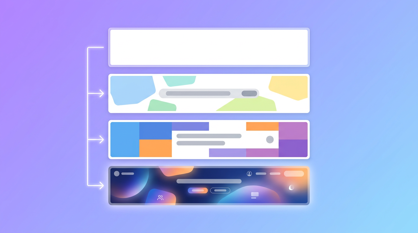
Step 1: Set Your Canvas to 1584 x 396
Start a new design at exactly 1584 x 396 pixels. Building at the correct size from the start means no awkward cropping when you upload.
Step 2: Add Your Core Message
Decide what the banner should communicate. For most people that is a short tagline, what you do, and maybe a way to reach you. Keep text minimal, around 5 to 10 words, so it stays readable at a glance. Place it in the center safe zone.
Step 3: Design It to Match Your Brand
Use colors and fonts that match your personal brand or company identity. Consistency across your profile, posts, and other assets makes you look established. If you have a brand kit, pull your colors from there.
If you do not want to wrestle with design software, an AI tool like Krumzi can create a LinkedIn banner from a text description, correctly sized, then let you edit every element. You describe the vibe, it handles the layout.
Step 4: Export and Upload
Export as PNG or JPEG under 8 MB, then upload it through the edit pencil on your LinkedIn banner. Preview it on both desktop and mobile, and confirm nothing important is hidden behind your profile photo.
Design Tips for a Banner That Works

- Less is more. A clean banner with one clear message beats a cluttered collage. White space is your friend.
- Make it readable on mobile. More than half of LinkedIn traffic is mobile, so test your text size on a phone.
- Reinforce your headline. Your banner and your profile headline should tell one consistent story.
- Refresh it periodically. Update your banner when your role, offer, or focus changes so it always reflects the current you.
Once your banner is set, keep the momentum going across your whole presence. Our guide on making your social media look professional covers the rest of your profile, and if you post on LinkedIn, LinkedIn carousel posts are a great next format. For sizing across other platforms, bookmark our social media image size guide, and if you also run a YouTube channel, our YouTube banner guide covers that too.
Frequently Asked Questions
What is the correct LinkedIn banner size in 2026?
The correct LinkedIn banner size for a personal profile is 1584 x 396 pixels, a 4:1 aspect ratio. Company page covers use 1128 x 191 pixels, or 4200 x 700 for a high-resolution version.
Why does my LinkedIn banner look blurry?
Blurriness usually comes from uploading an image smaller than 1584 x 396 or from heavy compression. Design at the exact size, keep resolution at 300 DPI or higher, and export as PNG for text-based banners.
Where should I put text on my LinkedIn banner?
Keep text in the central 1350 x 220 pixel safe zone. Avoid the bottom-left corner, where your profile photo sits, and leave space at the edges so mobile cropping does not cut anything off.
What file format is best for a LinkedIn banner?
Use PNG for banners with text or a logo because it keeps edges sharp. Use JPEG for photo-heavy banners. Keep the file under 8 MB.
How do I make a LinkedIn banner without design skills?
Use an AI design tool like Krumzi. Describe what you want, get a correctly sized 1584 x 396 banner, and edit the colors, text, and layout until it matches your brand. No design experience needed.
Ready to upgrade that default gradient? Design a banner that fits perfectly in Krumzi and make your profile work harder for you.

 Facebook
 X
X LinkedIn


