On this page
A seamless Instagram carousel is one of the most scroll-stopping formats you can post. Instead of separate slides, a single wide image flows uninterrupted as people swipe, and that little moment of "wait, it keeps going" is exactly what pulls someone deeper into your post.
The good news: you do not need to be a designer to make one. In this guide you will learn how to make a seamless Instagram carousel from start to finish, including the exact pixel sizes, the easiest way to split your image, and the design habits that keep your slides lined up perfectly.
What Is a Seamless Instagram Carousel?
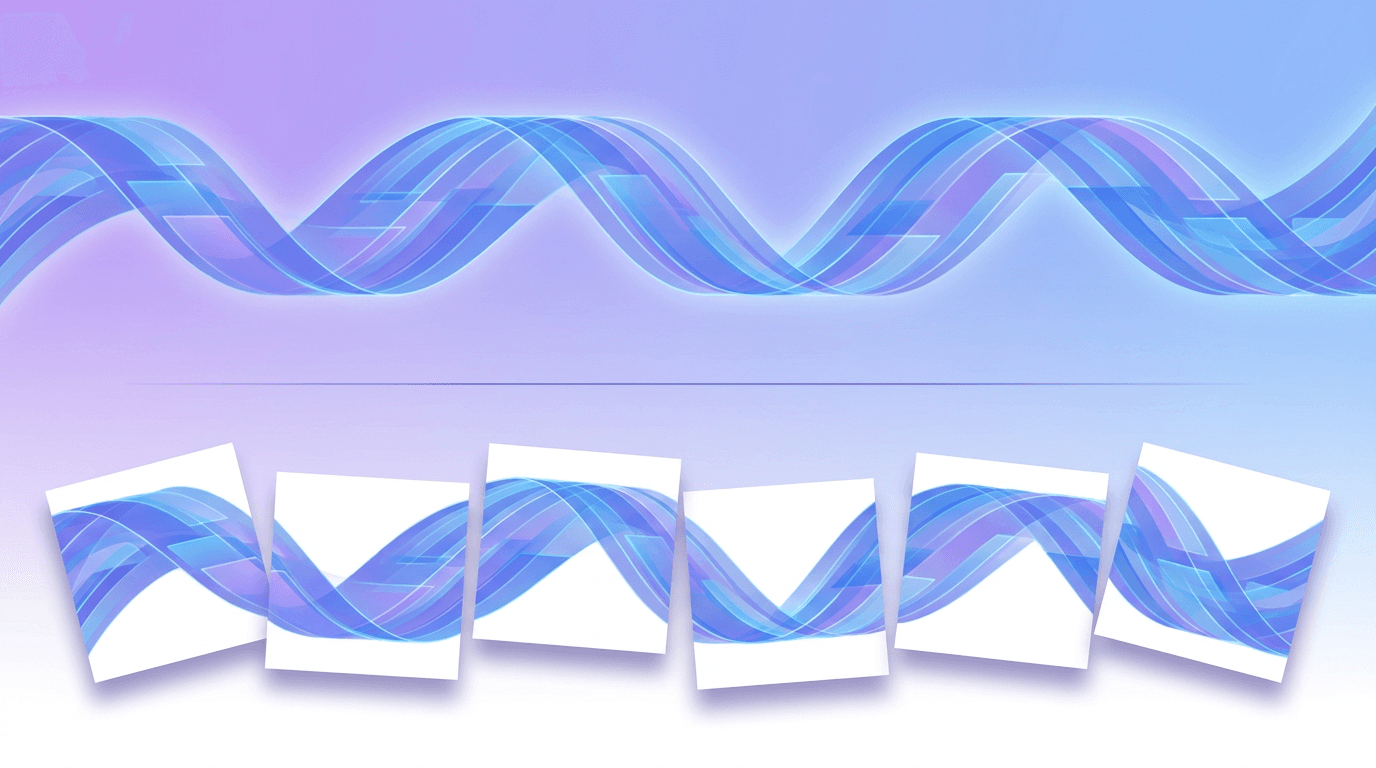
A seamless Instagram carousel (sometimes called a panorama or continuous carousel) is a multi-slide post where one image is split into equal pieces. When someone swipes, the pieces connect edge to edge, so the artwork appears to slide across the screen as a single continuous scene.
It works because Instagram shows carousel slides side by side as you swipe. If every slide shares the same height, width, and alignment, the seam between them disappears and the image reads as one.
Brands use this format for panoramic photos, wide product shots, before-and-after reveals, and bold text banners that stretch across several slides. It signals effort, and effort earns attention.
The Exact Sizes You Need
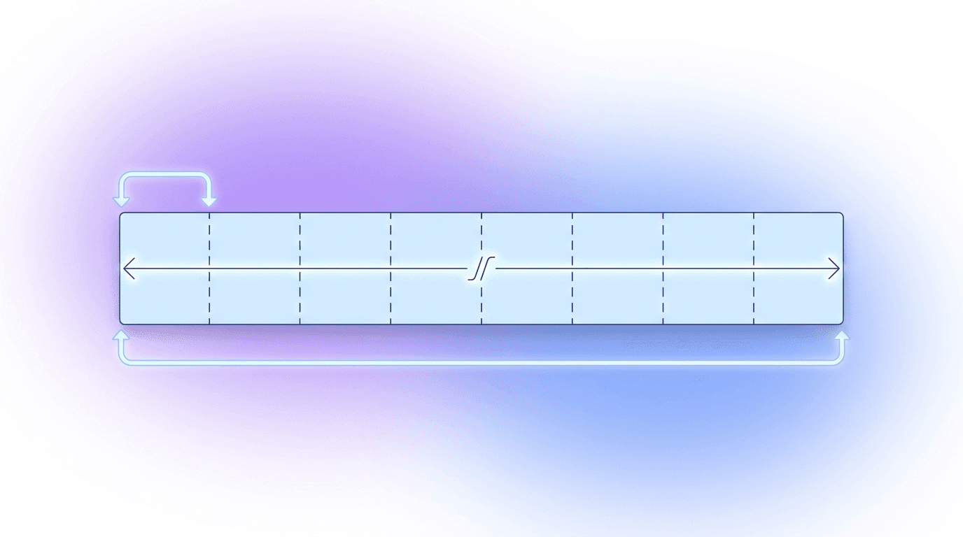
Getting the dimensions right is 90 percent of the battle. Every slide has to be identical in size, or the seam will jump.
| Slides | Minimum source width | Each slide size | Aspect ratio |
|---|---|---|---|
| 2 slides | 2160 px | 1080 x 1350 px | 4:5 |
| 3 slides | 3240 px | 1080 x 1350 px | 4:5 |
| 4 slides | 4320 px | 1080 x 1350 px | 4:5 |
| 5 slides | 5400 px | 1080 x 1350 px | 4:5 |
The rule is simple: your source image needs to be at least 1080 pixels wide multiplied by the number of slides. For a 3-slide carousel, that means a canvas at least 3240 pixels wide. Use the 4:5 portrait ratio (1080 x 1350) for each slide, because portrait takes up the most screen space in the feed.
Three slides is the sweet spot for most posts. It gives you enough width to create an impressive sweep while keeping swipe completion high.
How to Make a Seamless Instagram Carousel in 5 Steps
Step 1: Start With a Wide Canvas
Decide how many slides you want, then build or choose an image that matches the total width. For a 3-slide post, work on a canvas that is 3240 x 1350 pixels. If you are using a panorama photo from your phone, most modern phones shoot panoramas between 6000 and 10000 pixels wide, which is more than enough.
Step 2: Design the Full Scene First
Treat the whole width as one artboard. Place your background, subject, and any text across the entire canvas before you think about slide boundaries. Designing the complete picture first is what makes the final swipe feel intentional rather than chopped up.
If you would rather skip the manual setup entirely, an AI design tool like Krumzi can build the full-width layout for you from a text description, then let you edit every element before you split it. No design software, no fiddling with guides.
Step 3: Keep Key Elements Away From the Seams
Here is where most seamless carousels fall apart. Avoid placing faces, logos, or important words directly on a slide boundary. Instagram adds a small gap between slides as you swipe, so anything sitting on a seam gets cut awkwardly. Shift the important stuff toward the center of each slide.
Step 4: Split the Image Into Equal Slides
Now cut the wide image into equal vertical pieces. You can do this manually with guides in any design tool, but a dedicated carousel splitter is faster and removes the risk of uneven cuts. Upload your wide image, choose a horizontal layout like 1x3 or 1x5, and download all the slides at once. Every piece comes out at exactly 1080 x 1350, so alignment stays perfect.
Step 5: Upload in the Right Order
When you post, add the slides left to right: slide 1 first, then slide 2, then slide 3. This keeps the swipe direction natural so the image reveals in the order you designed it. Preview the post before publishing and swipe through once to confirm the seams line up.
Design Tips That Make the Effect Land
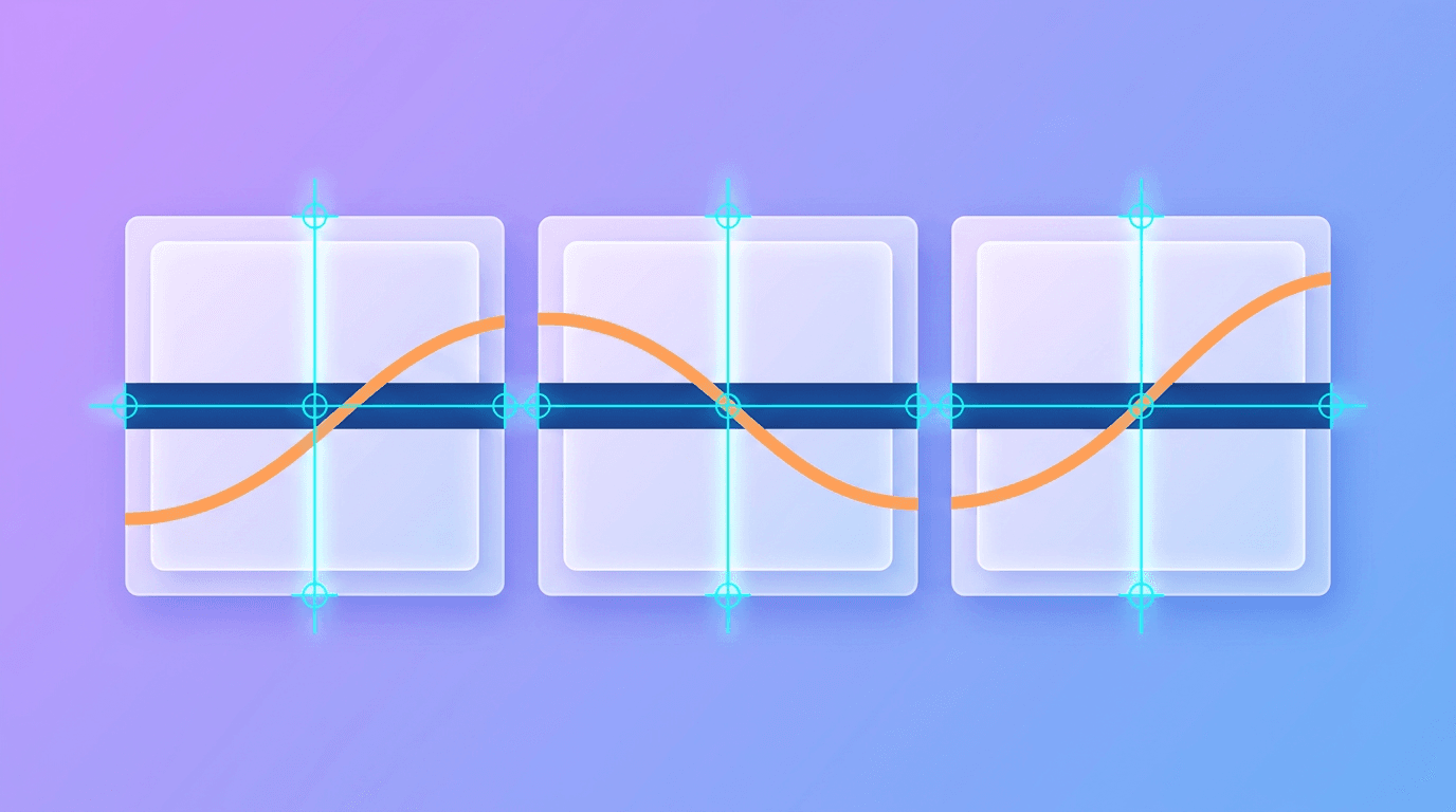
- Add a swipe cue. A simple arrow on the first slide or a caption like "Swipe to see the full view" nudges people to keep going. Completion is the whole point of a seamless carousel.
- Use continuous elements. A line, road, horizon, or color gradient that runs across all slides reinforces the illusion of one image.
- Match your export settings. Export every slide at the same resolution and format (PNG for graphics, JPG for photos) so compression does not shift colors between slides.
- Test on mobile. Almost everyone sees your carousel on a phone, so check it there before you post.
Want more format inspiration once you have the technique down? Our roundup of Instagram carousel ideas is a good next stop, and if you are new to the format, start with what an Instagram carousel post is.
Common Mistakes to Avoid
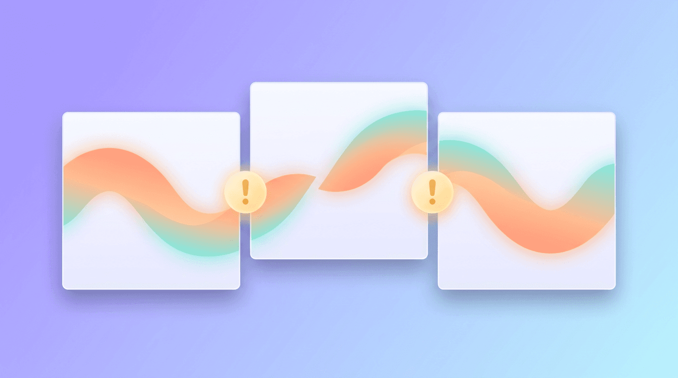
The biggest one is mixing aspect ratios. If even a single slide has a different ratio, the continuous effect breaks with a visible jump. Lock every slide to 4:5.
The second mistake is low resolution. If your source image is too small and you stretch it across five slides, the result looks soft and pixelated. Always start wide, then split down.
Finally, do not overload the design. A seamless carousel is already doing visual work, so busy backgrounds and too much text fight the effect. Give it room to breathe.
For a broader look at getting your slide dimensions right across every platform, see our social media image size guide. And if you want to explore the wider format, our carousel post guide covers non-seamless layouts too.
Frequently Asked Questions
What size is a seamless Instagram carousel?
Each slide should be 1080 x 1350 pixels (4:5 ratio). Your source image needs to be at least 1080 pixels wide times the number of slides, so a 3-slide carousel needs a canvas at least 3240 pixels wide.
How many slides should a seamless carousel have?
Three slides is ideal for most posts. It creates a strong sweep effect while keeping swipe completion high. You can go up to 10, but more slides means a wider source image and a higher chance people drop off before the end.
Can I make a seamless carousel without design skills?
Yes. You can design the full-width scene with an AI tool like Krumzi by describing what you want, then use a carousel splitter to cut it into equal slides. No manual guides or design software required.
Why do my carousel slides look misaligned?
Misalignment almost always comes from slides that are not the exact same size or aspect ratio. Make sure every slide is 1080 x 1350 and exported at the same resolution, and keep important elements off the seams.
Do seamless carousels get more engagement?
They tend to earn strong swipe rates because the format invites people to keep going to see the full image. Higher swipe and dwell time can signal quality to the Instagram algorithm, which may help reach.
Ready to build one? Describe your idea in Krumzi, edit the full-width design, then split and post. Your next carousel could be the one that stops the scroll.
A month of posts, designed before your coffee cools
Describe the post. Krumzi designs it from scratch, on your brand, fully editable.
Make your first design freeFree to make, no card. Only pay if you download it.